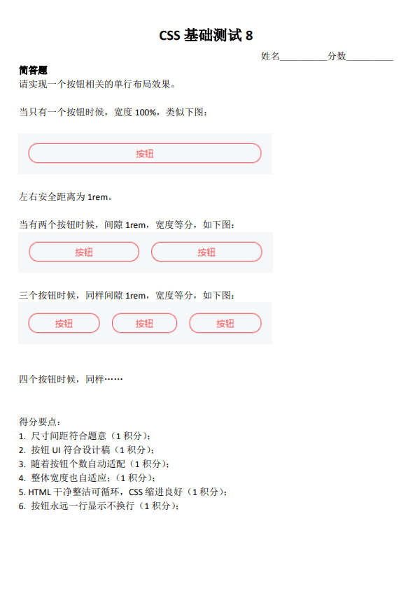
练习地址:小测答题收集区
CSS 测试一
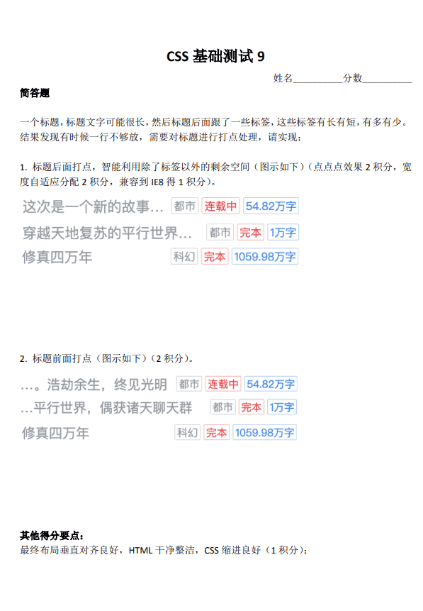
具体实现
overflow: hidden + float(不完美,显示的顺序与实际的 html 顺序不一致)
<!DOCTYPE html>
<html lang="en">

<head>
    <meta charset="UTF-8">
    <meta name="viewport" content="width=device-width, initial-scale=1.0">
    <meta http-equiv="X-UA-Compatible" content="ie=edge">
    <title>Document</title>
    <style>
        body {
            background-color: white;
        }

        .list {
            list-style: none;
            padding: 0;
        }

        .item {
            height: 40px;
            line-height: 40px;
            overflow: hidden; /* 创建BFC,以利于自动分配空间 */
        }

        .title {
            overflow: hidden;
            white-space: nowrap;
            text-overflow: ellipsis;
            color: rgb(182, 185, 190);
            font-size: 18px;
        }

        .tag-list {
            float: right;
            margin-left: 10px;
        }

        .tag-list > span {
            border: 1px solid;
            padding: 2px;
            font-size: 14px;
        }

        .tag-list > span:nth-child(1) {
            border-color: rgb(182, 185, 190);
            color: rgb(182, 185, 190);
        }

        .tag-list > span:nth-child(2) {
            border-color: rgb(223, 98, 97);
            color: rgb(223, 98, 97);
        }

        .tag-list > span:nth-child(3) {
            border-color: rgb(116, 162, 234);
            color: rgb(116, 162, 234);
        }
        /* 注意 title 必须放在后面 */

        /* 所有的方法都是按照此方法,不再举例 */
        .list[reserve] .title{
            direction: rtl;
        }
    </style>
</head>
<body>
    <ul class="list">
        <li class="item">
            <div class="tag-list">
                <span class="tag">标签1</span>
                <span class="tag">标签2</span>
                <span class="tag">标签3</span>
            </div>
            <div class="title">这是一个长度不确定的标题标题这是一个长度不确定的标题标题这是一个长度不确定的标题标题这是一个长度不确定的标题标题这是一个长度不确定的标题标题这是一个长度不确定的标题标题</div>
        </li>
    </ul>

    <ul class="list" reserve>
        <li class="item">
            <div class="tag-list">
                <span class="tag">标签1</span>
                <span class="tag">标签2</span>
                <span class="tag">标签3</span>
            </div>
            <div class="title">这是一个长度不确定的标题标题这是一个长度不确定的标题标题这是一个长度不确定的标题标题这是一个长度不确定的标题标题这是一个长度不确定的标题标题这是一个长度不确定的标题标题</div>
        </li>
    </ul>
</body>

</html>
flex + flex:1
<!DOCTYPE html>
<html lang="en">

<head>
    <meta charset="UTF-8">
    <meta name="viewport" content="width=device-width, initial-scale=1.0">
    <meta http-equiv="X-UA-Compatible" content="ie=edge">
    <title>Document</title>
    <style>
        body {
            background-color: white;
        }

        .list {
            list-style: none;
            padding: 0;
        }

        .item {
            display: flex;
        }

        .title {
            overflow: hidden;
            white-space: nowrap;
            text-overflow: ellipsis;
            color: rgb(182, 185, 190);
            font-size: 18px;
            /* flex-grow: 1; 定义项目的放大比例,默认值为0,即如果存在剩余空间,也不放大
                flex-shrink: 1; 定义了项目的缩小比例,默认为1,即如果空间不足,项目将缩小。
                flex-basis: 0%; 定义了在分配多余空间之前,项目占据的主轴空间(main size)。
                浏览器根据这个属性,计算主轴是否有多余空间。它的默认值为auto,即项目的本来大小
            */
            flex: 1;
        }

        .tag-list {
            margin-left: 10px;
        }

        .tag-list > span {
            border: 1px solid;
            padding: 2px;
            font-size: 14px;
        }

        .tag-list > span:nth-child(1) {
            border-color: rgb(182, 185, 190);
            color: rgb(182, 185, 190);
        }

        .tag-list > span:nth-child(2) {
            border-color: rgb(223, 98, 97);
            color: rgb(223, 98, 97);
        }

        .tag-list > span:nth-child(3) {
            border-color: rgb(116, 162, 234);
            color: rgb(116, 162, 234);
        }
    </style>
</head>

<body>
  <ul class="list">
    <li class="item">
        <div class="title">这是一个长度不确定的标题标题这是一个长度不确定的标题标题这是一个长度不确定的标题标题这是一个长度不确定的标题标题这是一个长度不确定的标题标题这是一个长度不确定的标题标题</div>
        <div class="tag-list">
            <span class="tag">标签1</span>
            <span class="tag">标签2</span>
            <span class="tag">标签3</span>
        </div>
    </li>
  </ul>
</body>

</html>
table + table-layout: fixed(兼容性较好)
<!DOCTYPE html>
<html lang="en">

<head>
    <meta charset="UTF-8">
    <meta name="viewport" content="width=device-width, initial-scale=1.0">
    <meta http-equiv="X-UA-Compatible" content="ie=edge">
    <title>Document</title>
    <style>
        body {
            background-color: white;
        }

        .list {
            list-style: none;
            padding: 0;
        }

        .item {
            display: table;
            width: 100%;
            line-height: 40px;
        }

        .title-container {
            display: table-cell;
            width: 9999px;
        }

        .table-fixed {
            /* 打点效果只有在 table-layout: fixed 才有效果 */
            table-layout: fixed;
            display: table;
            width: 100%;
        }

        .title {
            display: table-cell;
            overflow: hidden;
            white-space: nowrap;
            text-overflow: ellipsis;
            color: rgb(182, 185, 190);
            font-size: 18px;
        }

        .tag-list {
            margin-left: 10px;
            display: table-cell;
            white-space: nowrap;
        }

        .tag-list > span {
            border: 1px solid;
            padding: 2px;
            font-size: 14px;
        }

        .tag-list > span:nth-child(1) {
            border-color: rgb(182, 185, 190);
            color: rgb(182, 185, 190);
        }

        .tag-list > span:nth-child(2) {
            border-color: rgb(223, 98, 97);
            color: rgb(223, 98, 97);
        }

        .tag-list > span:nth-child(3) {
            border-color: rgb(116, 162, 234);
            color: rgb(116, 162, 234);
        }
    </style>
</head>

<body>
  <ul class="list">
    <li class="item">
        <div class="title-container">
            <div class="table-fixed">
                <span class="title">
                    这是一个长度不确定的标题标题这是一个长度不确定的标题标题这是一个长度不确定的标题标题这是一个长度不确定的标题标题这是一个长度不确定的标题标题这是一个长度不确定的标题标题
                </span>
            </div>
        </div>
        <div class="tag-list">
            <span class="tag">标签1</span>
            <span class="tag">标签2</span>
            <span class="tag">标签3</span>
        </div>
    </li>
    <li class="item">
        <div class="title-container">
            <div class="table-fixed">
                <span class="title">
                    这是一个长度不确定的标题标题长度不确定的标题标题这是一个长度不确定长度不确定的标题标题这是一个长度不确定
                </span>
            </div>
        </div>
        <div class="tag-list">
            <span class="tag">标签1</span>
            <span class="tag">标签2</span>
            <span class="tag">标签3</span>
        </div>
    </li>
  </ul>
</body>

</html>
实现要点
- 大家布局其实这 3 类:float+overflow,然后是 flex 布局,很少人使用的 table 布局。
- float 布局技巧:float:right+overflow:hidden;text-overflow:ellipsis;white-space:nowrap; 原理:overflow:hidden 可以创建格式化上下文,也就是 BFC,类似结界,不受浮动影响,自动分配剩余空间。
- flex 布局:display:flex > flex: 1;overflow:hidden;text-overflow:ellipsis;white-space:nowrap;
- 重点是 table 布局:float 布局有个非常明显的不足,那就是 DOM 的位置和视觉是不一致的。table 布局虽然效果有,但是却有很多的不足。1. 左侧 table-cell 的尺寸不建议使用字符撑开,然后内容绝对定位打点布局有较大的限制。非 table-layout:fixed 的表格,其每个单元格尺寸宽度是根据里面内容自动分配的,如果你没有设置 white-space: nowrap 是自动宽度自适应的。但是设置了 white-space: nowrap 则尺寸表现就不符合要求,怎么办呢?其实很简单,再嵌套一层 display:table;table-layout:fixed;的元素。table 布局中,打点只能在 table-layout:fixed 的场景下。所以,我们设置很大宽度的 table-cell 的子元素 display:table;table-layout:fixed;此时就能正常打点了。优点:兼容性更好,DOM 顺序符合认知。
- 开头打点 direction: rtl 就可以。
CSS 测试二
具体实现
flex + flex:1
<!DOCTYPE html>
<html lang="en">

<head>
    <meta charset="UTF-8">
    <meta name="viewport" content="width=device-width, initial-scale=1.0">
    <meta http-equiv="X-UA-Compatible" content="ie=edge">
    <title>Document</title>
    <style>
        body {
            background-color: white;
        }

        .btn-group {
            display: flex;
            margin-bottom: 32px;
        }

        .btn {
            flex: 1;
            margin: 0 0.5rem;
            padding: 6px 0;
            color: rgb(227, 140, 143);
            border: 1px solid currentColor;
            border-radius: 15px;
        }
    </style>
</head>

<body>
    <div class="btn-group">
        <button class="btn btn-danger">按钮</button>
    </div>
    <div class="btn-group">
        <button class="btn btn-danger">按钮</button>
        <button class="btn btn-danger">按钮</button>
    </div>
    <div class="btn-group">
        <button class="btn btn-danger">按钮</button>
        <button class="btn btn-danger">按钮</button>
        <button class="btn btn-danger">按钮</button>
    </div>
</body>

</html>
grid + grid-template-columns: repeat(auto-fit, minmax(0, 1fr))
<!DOCTYPE html>
<html lang="en">

<head>
    <meta charset="UTF-8">
    <meta name="viewport" content="width=device-width, initial-scale=1.0">
    <meta http-equiv="X-UA-Compatible" content="ie=edge">
    <title>Document</title>
    <style>
        body {
            background-color: white;
        }

        .btn-group {
            display: grid;
            /* 设置行和列的大小,在行轨道或列轨道两边是网格线。 */
            /* repeat表示网格轨道的重复部分,以一种更简洁的方式去表示大量而且重复列的表达式 */
            /* minmax 是一个来定义大小范围的属性 */
            grid-template-columns: repeat(auto-fit, minmax(0, 1fr));
            /* grid-auto-flow: column 也可以 */
            grid-gap: 1rem;
            margin-bottom: 32px;
        }

        .btn {
            margin: 0 0.5rem;
            padding: 6px 0;
            color: rgb(227, 140, 143);
            border: 1px solid currentColor;
            border-radius: 15px;
        }
    </style>
</head>

<body>
    <div class="btn-group">
        <button class="btn btn-danger">按钮</button>
    </div>
    <div class="btn-group">
        <button class="btn btn-danger">按钮</button>
        <button class="btn btn-danger">按钮</button>
    </div>
    <div class="btn-group">
        <button class="btn btn-danger">按钮</button>
        <button class="btn btn-danger">按钮</button>
        <button class="btn btn-danger">按钮</button>
    </div>
</body>

</html>
table + table-layout: fixed(兼容性较好)
<!DOCTYPE html>
<html lang="en">

<head>
    <meta charset="UTF-8">
    <meta name="viewport" content="width=device-width, initial-scale=1.0">
    <meta http-equiv="X-UA-Compatible" content="ie=edge">
    <title>Document</title>
    <style>
        body {
            background-color: white;
        }

        .btn-group {
            display: table;
            table-layout: fixed;
            width: 100%;
        }

        .btn-group-wrapper {
            display: table-cell;
            padding: 1rem;
        }

        .btn {
            width: 100%;
            margin: 0 0.5rem;
            padding: 5px;
            color: rgb(227, 140, 143);
            border: 1px solid rgb(227, 140, 143);
            border-radius: 15px;
        }
    </style>
</head>

<body>
    <div class="btn-group">
        <div class="btn-group-wrapper">
            <button class="btn btn-danger">按钮</button>
        </div>
    </div>
    <div class="btn-group">
        <div class="btn-group-wrapper">
            <button class="btn btn-danger">按钮</button>
        </div>
        <div class="btn-group-wrapper">
            <button class="btn btn-danger">按钮</button>
        </div>
    </div>
    <div class="btn-group">
        <div class="btn-group-wrapper">
            <button class="btn btn-danger">按钮</button>
        </div>
        <div class="btn-group-wrapper">
            <button class="btn btn-danger">按钮</button>
        </div>
         <div class="btn-group-wrapper">
            <button class="btn btn-danger">按钮</button>
        </div>
    </div>
</body>

</html>
实现要点
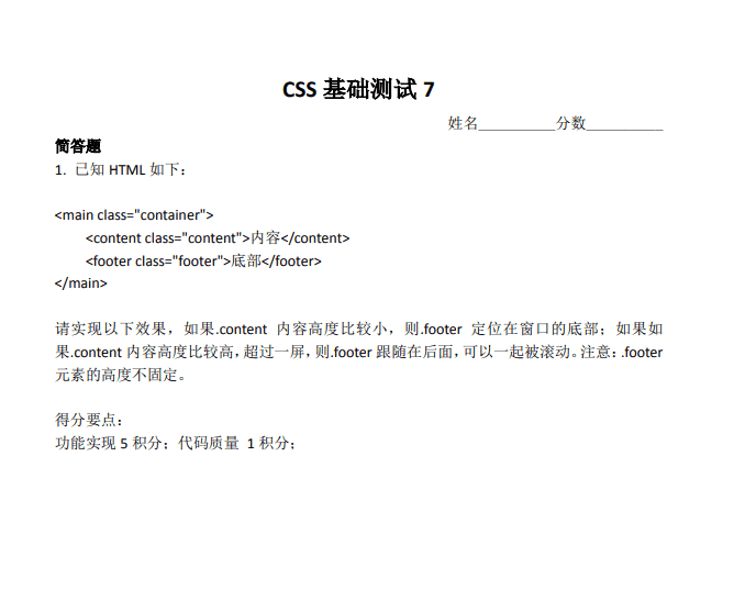
- flex 和 grid 布局都能实现我们想要的效果,但是推荐使用 flex 布局,因为语义更好。grid 更适合页面大的框架结构布局,偏向二维。本题语义偏向一维。虽然 grid 控制间隙更方便(grid-gap)。
- justify-content 可以不需要,flex-wrap 也是多余的,因为默认就是 nowrap,flex-direction 也是不需要的,因为默认就是 row。因此,我们直接在容器元素设置 display:flex 就好了。
- 子项可以 flex: 1,以及其他很多设置方法。例如 flex: auto;(语义更合适-推荐)。设置 flex:1 实际上空间分配是不足的,于是,等分。因此设置 flex:2, 3, 4…都是可以。还有就是 width:100%,除了还有一种方法:width:-webkit-fill-available 语义是更好的(推荐)。
- 下面是 grid 布局:grid-template-columns: repeat(auto-fit, minmax(0, 1fr))是一种方法,但是并不是最好的实现,因为这个比较难理解,也不好记忆。更好的实现是 grid-auto-flow: column;
- 兼容性更好的 table 布局,IE8+都支持,放心使用。.table { display: table; table-layout: fixed; width: 100%; }.cell { display: table-cell;} 固定组合。务必掌握,基础必备布局知识。
- 不少人.container 左右 0.5rem,子项 margin:0 .5rem 实现 1rem 间隙,这样方式和实际开发是不符合的。实际开发左右 1rem,是一个大的结构元素控制的。使用:last-child 或者:first-child 更符合实际开发,虽然代码更啰嗦了点,因为有一个重置。最好的实现其实还是使用:not()伪类(AsyncGuo 的实现),:not(:last-child) {margin-right: 1rem;} 或者 .btnitem + .btnitem 或者 .btnitem ~ .btnitem(IE7+)
CSS 测试三
具体实现
flex + space-between
<!DOCTYPE html>
<html lang="en">

<head>
    <meta charset="UTF-8">
    <meta name="viewport" content="width=device-width, initial-scale=1.0">
    <meta http-equiv="X-UA-Compatible" content="ie=edge">
    <title>Document</title>
    <style>
        body {
            background-color: white;
        }

        .container {
            display: flex;
            flex-direction: column;
            justify-content: space-between;
            min-height: 100vh;
        }

        .footer {
            color:#fff;
            background:#78a5f1;
        }
    </style>
</head>

<body>
    <div class="container">
        <div class="content">内容</div>
        <footer class="footer">底部</footer>
    </div>
</body>

</html>
fixed(不完美)
<!DOCTYPE html>
<html lang="en">

<head>
    <meta charset="UTF-8">
    <meta name="viewport" content="width=device-width, initial-scale=1.0">
    <meta http-equiv="X-UA-Compatible" content="ie=edge">
    <title>Document</title>
    <style>
        body {
            background-color: white;
        }

        .container {
            position: fixed;
            top: 0;
            height: 100%;
        }

        .footer {
            /* 这里有点不符合题意,超过一屏之后没有跟随在 content 后面 */
            position: absolute;
            width: 100%;
            bottom: 0;
            color:#fff;
            background:#78a5f1;
        }
    </style>
</head>

<body>
    <div class="container">
        <div class="content">内容</div>
        <footer class="footer">底部</footer>
    </div>
</body>

</html>
grid + space-between
<!DOCTYPE html>
<html lang="en">

<head>
    <meta charset="UTF-8">
    <meta name="viewport" content="width=device-width, initial-scale=1.0">
    <meta http-equiv="X-UA-Compatible" content="ie=edge">
    <title>Document</title>
    <style>
        body {
            background-color: white;
        }

        .container {
            display: grid;
            min-height: 100vh;
            align-content: space-between;
        }

        .footer {
            color:#fff;
            background:#78a5f1;
        }
    </style>
</head>

<body>
    <div class="container">
        <div class="content">内容</div>
        <footer class="footer">底部</footer>
    </div>
</body>

</html>
flex + margin-top(完美)
<!DOCTYPE html>
<html lang="en">

<head>
    <meta charset="UTF-8">
    <meta name="viewport" content="width=device-width, initial-scale=1.0">
    <meta http-equiv="X-UA-Compatible" content="ie=edge">
    <title>Document</title>
    <style>
        body {
            background-color: white;
        }

        .container {
            display: flex;
            flex-direction: column;
            min-height: 100vh;
        }

        .footer {
            /* 元素如果没有高宽,尺寸会拉伸(或处在可拉伸上下文中)*/
            /* 则此时auto会智能分配剩余空间,实现上下左右或者居中对齐效果 */
            margin-top: auto;
            color:#fff;
            background:#78a5f1;
        }
    </style>
</head>

<body>
    <div class="container">
        <div class="content">内容</div>
        <footer class="footer">底部</footer>
    </div>
</body>

</html>
table + display: table-footer-group(兼容性较好)
<!DOCTYPE html>
<html lang="en">

<head>
    <meta charset="UTF-8">
    <meta name="viewport" content="width=device-width, initial-scale=1.0">
    <meta http-equiv="X-UA-Compatible" content="ie=edge">
    <title>Document</title>
    <style>
        body {
            background-color: white;
        }

        .container {
            display: table;
            height: 100vh;
        }

        .footer {
            display: table-footer-group;
            color:#fff;
            background:#78a5f1;
        }
    </style>
</head>

<body>
    <div class="container">
        <div class="content">内容</div>
        <footer class="footer">底部</footer>
    </div>
</body>

</html>
实现要点
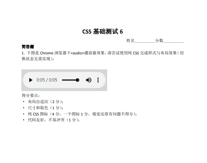
- 题意理解要准确:.content 不拉伸,不要影响浏览器默认的滚动;
- flex 布局是相对大家比较容易想到的实现:.container { display: flex; flex-direction: column; justify-content: space-between; min-height: 100vh;} 但是 IE9 不支持。
- 另外实现:.container{ display: table; min-height:100vh;}.footer{ display: table-footer-group; /_ IE8+支持 _/}。
- 如果 footer 高度固定,则实现方法就很多了,例如,绝对定位固定在底部,或者 margin 负值定位。
- grid 布局也是可以实现类似效果:.container {display: grid; min-height: 100vh; align-content: space-between;}
- 满分回答:.container { display: flex; flex-direction: column; min-height: 100vh; }footer { margin-top: auto;}
- margin:auto 是非常体现 CSS 理解深度的一个 CSS 声明。
- auto 智能的剩余宽度分配。元素如果没有高宽,尺寸会拉伸(或处在可拉伸上下文中),则此时 auto 会智能分配剩余空间,实现上下左右或者居中对齐效果。
- flex 布局下的所有元素就处于一种尺寸可拉伸的上下文环境,所以此时 footer 设置 margin-top: auto 是可以顶部对齐的(margin-top 自动剩余空间)。
CSS 测试四
具体实现
flex
<!DOCTYPE html>
<html lang="en">

<head>
    <meta charset="UTF-8">
    <meta name="viewport" content="width=device-width, initial-scale=1.0">
    <meta http-equiv="X-UA-Compatible" content="ie=edge">
    <title>Document</title>
    <style>
        body {
            background-color: white;
        }

        /********** 主容器 **********/
        .audio-controls {
            text-align: left;
        }

        /********** 样式容器 **********/
        .audio-controls-inner {
            font-size: 16px;      /* 控件尺寸 */
            color: #000;          /* 控件主题色 */
            background: #f1f3f4;  /* 控件背景色 */

            display: flex;
            align-items: center;
            min-width: 2.125em;
            height: 3.375em;
            padding: 0 .625em;
            border-radius: 2.125em;
        }

        /********** 组件按钮公用样式 **********/
        .audio-controls-button {
            flex: 0 0 2em;
            height: 2em;
            padding: 0;
            overflow: hidden;
            font-size: 100%;
            color: inherit;
            background: transparent;
            border: 0;
            border-radius: 2.25em;
            cursor: pointer;
            transition: background ease-in-out .2s;
        }

        .audio-controls-button:hover {
            background: rgba(0, 0, 0, .06);
        }

        .audio-controls-button::before {
            display: inline-block;
            content: "";
        }

        /********** 播放按钮 **********/
        .audio-controls-button[aria-label="play"]::before {
            transform: translate(30%, .16em);
            border: solid transparent;
            border-width: .55em .85em;
            border-left-color: currentColor;
        }

        /********** 暂停按钮 **********/
        .audio-controls-button[aria-label="pause"]::before {
            width: .375em;
            height: 48%;
            transform: translateY(.16em);
            text-align: center;
            border: solid currentColor;
            border-width: 0 .25em;
        }

        /********** 声音按钮 **********/
        .audio-controls-button[aria-label="volume"] {
            margin-left: 1em;
            margin-right: .25em;
        }

        .audio-controls-button[aria-label="volume"]::before {
            display: none;
        }

        /* 声音按钮图标 */
        .audio-controls-button-volume-icon {
            display: inline-block;
            padding: .3em .15em;
            margin-left: -.3em;
            transform: translate(-50%, .15em);
            border: .3em solid transparent;
            border-right-color: currentColor;
            box-shadow: inset 1em 0 0;
        }

        .audio-controls-button-volume-icon > i {
            position: relative;
            left: calc(.3125em * 2);
        }

        .audio-controls-button-volume-icon > i::before {
            content: "";
            position: absolute;
            width: .7em;
            height: 1.4em;
            transform: translateY(-50%);
            box-sizing: border-box;
            border: .16em solid;
            border-left: 0;
            border-radius: 0 .7em .7em 0;
        }

        .audio-controls-button-volume-icon > i::after {
            content: "";
            position: absolute;
            width: .3em;
            height: .6em;
            transform: translateY(-50%);
            background: currentColor;
            border-radius: 0 .3em .3em 0;
        }

        /********** 选项菜单 **********/
        .audio-controls-button[aria-label="menu"]::before  {
            width: .3125em;
            height: .3125em;
            transform: translateY(-50%);
            background: currentColor;
            border-radius: 50%;
            box-shadow: 0 .5em 0, 0 -.5em 0;
        }

        /********** 播放时间文本 **********/
        .audio-controls-time {
            font-size: .875em;
            line-height: 1;
            opacity: .85;
        }

        .audio-controls-time[aria-label="current"] {
            margin-left: .375em;
        }

        .audio-controls-time[aria-label="remaining"]::before {
            content: "/";
            margin: 0 .25em;
        }

        /********** 时间轴 **********/
        .audio-controls-timeline {
            -webkit-appearance: none;
            flex: 1;
            height: .25em;
            margin-left: 1em;
            font-size: 100%;
            color: inherit;
            background: currentColor;
            border-radius: .25em;
            mix-blend-mode: darken;
        }

        .audio-controls-timeline::-webkit-slider-thumb {
            -webkit-appearance: none;
            width: 0;
            height: 0;
            border: .375em solid;
            border-radius: 50%;
            box-shadow: 50vw 0 0 50vw rgba(255,255,255,.5);
        }
    </style>
</head>

<body>
    <div class="audio-controls">
        <div class="audio-controls-inner">
            <button class="audio-controls-button" aria-label="play">
            </button>
            <span class="audio-controls-time" aria-label="current">0:05</span>
            <span class="audio-controls-time" aria-label="remaining">0:05</span>
            <input class="audio-controls-timeline" type="range" max="5000" value="2000" />
            <button class="audio-controls-button" aria-label="volume">
                <span class="audio-controls-button-volume-icon">
                    <i></i>
                </span>
            </button>
            <button class="audio-controls-button" aria-label="menu">
            </button>
        </div>
    </div>
</body>

</html>
实现要点
- 自适应使用 flex 是比较好的方法,图标按钮尺寸固定,进度条宽度自适应;
- 进度条使用
input[type="range"]是非常棒的实现与想法; - 自适应不是等比例缩放,而是进度条宽度自适应;
- 注意视觉还原;
- 命名上注意上下文,例如 audio-开头;
- CSS 图标尽量使用伪元素,更好维护;
- CSS 图标常用技巧:万能,box-shadow,linear-gradient/radial-radient,clip-path。
CSS 测试五
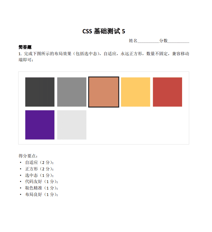
具体实现
grid
<!DOCTYPE html>
<html lang="en">
<head>
  <meta charset="UTF-8">
  <meta name="viewport" content="width=device-width, initial-scale=1.0">
  <meta http-equiv="X-UA-Compatible" content="ie=edge">
  <title>Document</title>
  <style>
    body {
      background-color: white;
    }

    /* css reset */
    html {
      font-size: 16px;
    }

    ul {
      padding: 0;
      margin: 0;
      list-style: none;
    }

    /* 布局 */
    .square-box {
      display: grid;
      grid-template-columns: repeat(5, 1fr);  /* 划分 5 个等宽片段 */
      grid-template-rows: 1fr 1fr;
      grid-gap: .5rem .375rem;
    }

    .square-item {
      padding-bottom: 100%;  /* 容器的 padding 百分比值按其宽度来计算 */
      outline: .15rem solid transparent;
    }

    .square-item.active {
      outline-color: #222;
    }

    /* 颜色 */
    .bg-dark {
      background: #424242;
    }

    .bg-gray {
      background: #8c8c8c;
    }

    .bg-sienna {
      background: #d48b69;
    }

    .bg-gold {
      background: #fecb66;
    }

    .bg-crimson {
      background: #c54941;
    }

    .bg-orchid {
      background: #591c93;
    }

    .bg-silver {
      background: #e6e6e6;
    }

    /* 响应式断点(CSS基础测试4),基于 iPhone6 尺寸 */
    @media screen and (min-width: 375px) {
      html {
        font-size: calc(100% + 2 * (100vw - 375px) / 39);
        font-size: calc(16px + 2 * (100vw - 375px) / 39);
      }
    }

    @media screen and (min-width: 414px) {
      html {
        font-size: calc(112.5% + 4 * (100vw - 414px) / 586);
        font-size: calc(18px + 4 * (100vw - 414px) / 586);
      }
    }
  </style>
</head>

<body>
  <ul class="square-box">
    <li class="square-item bg-dark"></li>
    <li class="square-item bg-gray"></li>
    <li class="square-item bg-sienna active"></li>
    <li class="square-item bg-gold"></li>
    <li class="square-item bg-crimson"></li>
    <li class="square-item bg-orchid"></li>
    <li class="square-item bg-silver"></li>
  </ul>
</body>
</html>
flex
<!DOCTYPE html>
<html lang="en">
<head>
  <meta charset="UTF-8">
  <meta name="viewport" content="width=device-width, initial-scale=1.0">
  <meta http-equiv="X-UA-Compatible" content="ie=edge">
  <title>Document</title>
  <style>
    body {
      background-color: white;
    }

    .layout {
      padding: 4%;
      border: 1px solid #e8e8e8;
    }

    .layout-inner {
      display: flex;
      flex-wrap: wrap;
      flex-grow: 0;
    }

    .layout-item {
      flex-basis: 20%;
    }

    .layout-item-inner {
      position: relative;
      padding: 50%;
    }

    .layout-item-content {
      position: absolute;
      top: 10%;
      bottom: 10%;
      right: 10%;
      left: 10%;
      margin: auto;
    }

    .layout-item--active .layout-item-content {
      outline: #272423 4px solid;
    }

    .layout-item:nth-child(7n+1) .layout-item-content {
      background: #424242;
    }

    .layout-item:nth-child(7n+2) .layout-item-content {
      background: #8c8c8c;
    }

    .layout-item:nth-child(7n+3) .layout-item-content {
      background: #d38b69;
    }

    .layout-item:nth-child(7n+4) .layout-item-content {
      background: #fecb66;
    }

    .layout-item:nth-child(7n+5) .layout-item-content {
      background: #c54941;
    }

    .layout-item:nth-child(7n+6) .layout-item-content {
      background: #581c93;
    }

    .layout-item:nth-child(7n) .layout-item-content {
      background: #e6e6e6;
    }
  </style>
</head>

<body>
  <div class="layout">
    <div class="layout-inner">
      <div class="layout-item">
        <div class="layout-item-inner">
          <div class="layout-item-content">
          </div>
        </div>
      </div>
      <div class="layout-item">
        <div class="layout-item-inner">
          <div class="layout-item-content">
          </div>
        </div>
      </div>
      <div class="layout-item layout-item--active">
        <div class="layout-item-inner">
          <div class="layout-item-content">
          </div>
        </div>
      </div>
      <div class="layout-item">
        <div class="layout-item-inner">
          <div class="layout-item-content">
          </div>
        </div>
      </div>
      <div class="layout-item">
        <div class="layout-item-inner">
            <div class="layout-item-content">
            </div>
        </div>
      </div>
    </div>
  </div>
</body>
</html>
inline-block
<!DOCTYPE html>
<html lang="en">
<head>
  <meta charset="UTF-8">
  <meta name="viewport" content="width=device-width, initial-scale=1.0">
  <meta http-equiv="X-UA-Compatible" content="ie=edge">
  <title>Document</title>
  <style>
    body {
      background-color: white;
      margin: 0;
    }

    ul {
      padding: 0;
    }

    .box {
      --margin: 1%;
      font-size: 0;
    }

    li {
      width: 0;
      height: 0;
      padding: calc((100% / var(--itemNumber)) / 2 - var(--margin));
      display: inline-block;
      position: relative;
      margin: var(--margin);
    }

    li input {
      opacity: 0;
      position: absolute;
      top: 0;
      left: 0;
      margin: 0;
      width: 100%;
      height: 100%;
      z-index: 1;
    }

    li input:checked + .item {
      outline: 4px solid #222;
    }

    .item {
      position: absolute;
      top: 0;
      right: 0;
      left: 0;
      bottom: 0;
    }

    li:nth-child(7n+1) .item {
      background-color: #424242;
    }

    li:nth-child(7n+2) .item {
      background-color: #8c8c8c;
    }

    li:nth-child(7n+3) .item {
      background-color: #d48b69;
    }

    li:nth-child(7n+4) .item {
      background-color: #fecb66;
    }

    li:nth-child(7n+5) .item {
      background-color: #c54940;
    }

    li:nth-child(7n+6) .item {
      background-color: #591c93;
    }

    li:nth-child(7n+7) .item {
      background-color: #e6e6e6;
    }
  </style>
</head>

<body>
  <ul class="box" style="--itemNumber: 3">
    <li>
      <input type="radio" name="radio">
      <div class="item"></div>
    </li>
    <li>
      <input type="radio" name="radio">
      <div class="item"></div>
    </li>
    <li>
      <input type="radio" name="radio">
      <div class="item"></div>
    </li>
    <li>
      <input type="radio" name="radio">
      <div class="item"></div>
    </li>
    <li>
      <input type="radio" name="radio">
      <div class="item"></div>
    </li>
    <li>
      <input type="radio" name="radio">
      <div class="item"></div>
    </li>
    <li>
      <input type="radio" name="radio">
      <div class="item"></div>
    </li>
  </ul>
</body>
</html>
实现要点
- 在 grid 布局中,每个子项所相对计算的宽度已经划分好了,并不是父元素的宽度;
- outline 的优点的扩展的时候不占据额外的空间尺寸,但是缺点是强占了:focus 聚焦状态样式,更推荐使用 box-shadow 实现;
- flex 布局也是可以指定宽度,包括百分比;
- 正方形实现大家都用的是 padding 百分比,很好也很奇怪,如果你的宽度是使用 calc 计算得到(非百分比计算),设置 height 与之一样即可。
- 自适应的实现:1. grid 布局;2. flex(宽度要设置);3. float;4.inline-block;都是可以的。
- 关于选中态实现最推荐的方法:使用 radio 单选。优点:1. 无需任何 JS 参与; 2. 语义非常好,包括对辅助设备;3. 开发也很便捷;其他类似场景:新用户注册会让选择感兴趣的标签,也可以使用类似技术。
CSS 测试六
具体实现
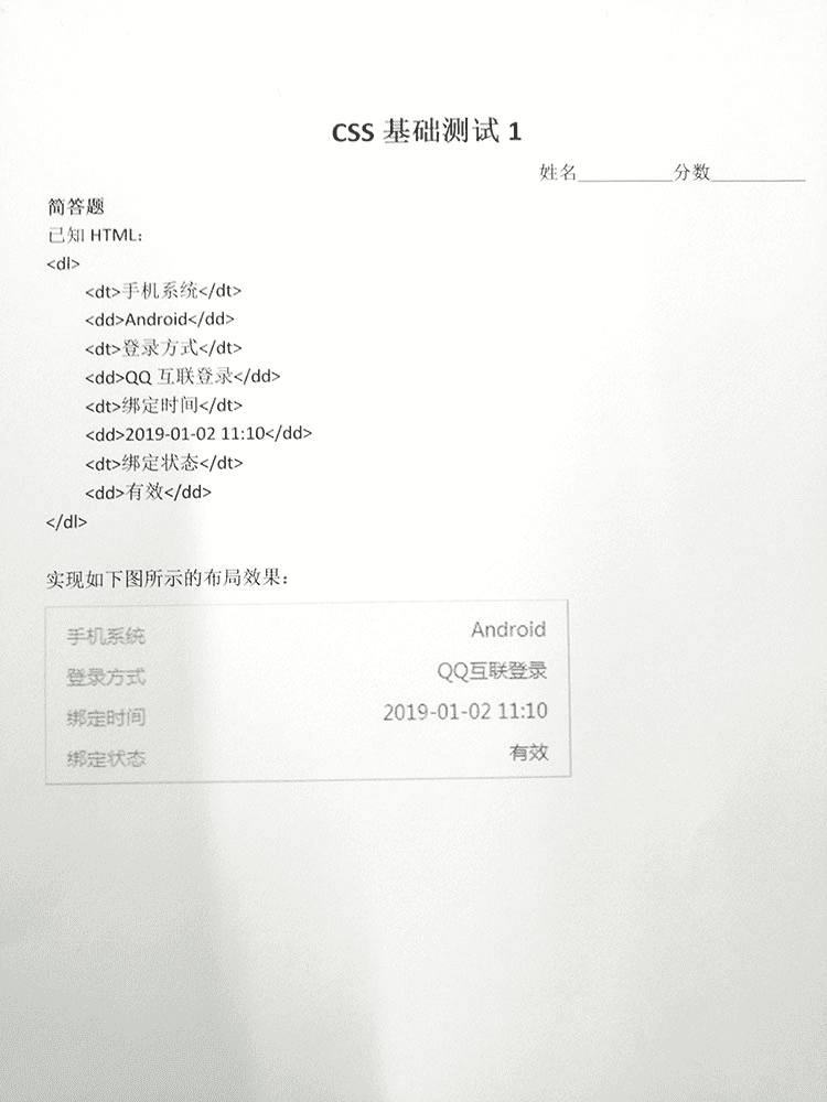
absolute
<!DOCTYPE html>
<html lang="en">

<head>
    <meta charset="UTF-8">
    <meta name="viewport" content="width=device-width, initial-scale=1.0">
    <meta http-equiv="X-UA-Compatible" content="ie=edge">
    <title>Document</title>
    <style>
        body {
            background-color: white;
        }

        dl {
            border: 1px solid #000;
        }

        dt {
            position: absolute;
        }

        dd {
            text-align: right;
            margin-left: 5em;
            word-break: break-all;
        }

        dd:empty::before {
            content: '--';
            color: #999;
        }
        /*
            此方法兼容性非常好,低版本IE浏览器也支持,
            但position:absolute元素的层叠顺便比较高,如果页面布局复杂,
            出现了元素层叠的场景,则此方法需要斟酌下,因为很可能会增加布局的复杂度(额外的z-index进行层级控制)。
        */
    </style>
</head>

<body>
    <dl>
        <dt>手机系统</dt>
        <dd>Android</dd>
        <dt>登录方式</dt>
        <dd>QQ互联登录</dd>
        <dt>绑定时间</dt>
        <dd></dd><!-- 内容为空的情况 -->
        <dt>绑定状态</dt>
        <dd>有效有效有效有效有效有效有效有效有效有效有效有效有效有效有效有效有效有效有效有效有效有效有效有效有效有效有效有效有效有效有效有效有效有效有效有效有效有效有效有效有效有效有效有效有效有效有效有效有效有效有效有效有效有效有效有效有效有效有效有效有效有效有效有效有效有效有效有效有效有效有效有效有效有效有效有效有效有效有效有效有效有效有效有效有效有效有效有效有效有效</dd><!-- 内容溢出的情况 -->
    </dl>
</body>

</html>
display: flex + width: calc(100% - 5em)
<!DOCTYPE html>
<html lang="en">

<head>
    <meta charset="UTF-8">
    <meta name="viewport" content="width=device-width, initial-scale=1.0">
    <meta http-equiv="X-UA-Compatible" content="ie=edge">
    <title>Document</title>
    <style>
        body {
            background-color: white;
        }

        dl {
            border: 1px solid #000;
            display: flex;
            flex-wrap: wrap;
        }

        dt {
            width: 5em;
        }

        dd {
            width: calc(100% - 5em);
            margin-left: 0;
            text-align: right;
            word-break: break-all;
        }

        dd:empty::before {
            content: '--';
            color: #999;
        }
    </style>
</head>

<body>
    <dl>
        <dt>手机系统</dt>
        <dd>Android</dd>
        <dt>登录方式</dt>
        <dd>QQ互联登录</dd>
        <dt>绑定时间</dt>
        <dd></dd><!-- 内容为空的情况 -->
        <dt>绑定状态</dt>
        <dd>有效有效有效有效有效有效有效有效有效有效有效有效有效有效有效有效有效有效有效有效有效有效有效有效有效有效有效有效有效有效有效有效有效有效有效有效有效有效有效有效有效有效有效有效有效有效有效有效有效有效有效有效有效有效有效有效有效有效有效有效有效有效有效有效有效有效有效有效有效有效有效有效有效有效有效有效有效有效有效有效有效有效有效有效有效有效有效有效有效有效</dd><!-- 内容溢出的情况 -->
    </dl>
</body>

</html>
grid + grid-template-columns: auto 1fr
<!DOCTYPE html>
<html lang="en">

<head>
    <meta charset="UTF-8">
    <meta name="viewport" content="width=device-width, initial-scale=1.0">
    <meta http-equiv="X-UA-Compatible" content="ie=edge">
    <title>Document</title>
    <style>
        body {
            background-color: white;
        }

        dl {
            border: 1px solid #000;
            display: grid;
            grid-template-columns: auto 1fr; /* auto代表分配剩余宽度,1fr代表自适应于内容*/
            grid-column-gap: 1em;
        }

        dd {
            text-align: right;
            margin-left: 0;
            word-break: break-all;
        }

        dd:empty::before {
            content: '--';
            color: #999;
        }
    </style>
</head>

<body>
    <dl>
        <dt>手机系统</dt>
        <dd>Android</dd>
        <dt>登录方式</dt>
        <dd>QQ互联登录</dd>
        <dt>绑定时间</dt>
        <dd></dd><!-- 内容为空的情况 -->
        <dt>绑定状态</dt>
        <dd>有效有效有效有效有效有效有效有效有效有效有效有效有效有效有效有效有效有效有效有效有效有效有效有效有效有效有效有效有效有效有效有效有效有效有效有效有效有效有效有效有效有效有效有效有效有效有效有效有效有效有效有效有效有效有效有效有效有效有效有效有效有效有效有效有效有效有效有效有效有效有效有效有效有效有效有效有效有效有效有效有效有效有效有效有效有效有效有效有效有效</dd><!-- 内容溢出的情况 -->
    </dl>
</body>

</html>
float: left + overflow: hidden
<!DOCTYPE html>
<html lang="en">

<head>
    <meta charset="UTF-8">
    <meta name="viewport" content="width=device-width, initial-scale=1.0">
    <meta http-equiv="X-UA-Compatible" content="ie=edge">
    <title>Document</title>
    <style>
        body {
            background-color: white;
        }

        dl {
            border: 1px solid #000;
        }

        dt {
            float: left;
            width: 5em;
        }

        dd {
            text-align: right;
            word-break: break-all;
            overflow: hidden; /* 防止文字内容多的时候环绕 dt 元素 */
        }

        dd:empty::before {
            content: '--';
            color: #999;
        }
    </style>
</head>

<body>
    <dl>
        <dt>手机系统</dt>
        <dd>Android</dd>
        <dt>登录方式</dt>
        <dd>QQ互联登录</dd>
        <dt>绑定时间</dt>
        <dd></dd><!-- 内容为空的情况 -->
        <dt>绑定状态</dt>
        <dd>有效有效有效有效有效有效有效有效有效有效有效有效有效有效有效有效有效有效有效有效有效有效有效有效有效有效有效有效有效有效有效有效有效有效有效有效有效有效有效有效有效有效有效有效有效有效有效有效有效有效有效有效有效有效有效有效有效有效有效有效有效有效有效有效有效有效有效有效有效有效有效有效有效有效有效有效有效有效有效有效有效有效有效有效有效有效有效有效有效有效</dd><!-- 内容溢出的情况 -->
    </dl>
</body>

</html>
margin: -1.5em 0 0 5em
<!DOCTYPE html>
<html lang="en">

<head>
    <meta charset="UTF-8">
    <meta name="viewport" content="width=device-width, initial-scale=1.0">
    <meta http-equiv="X-UA-Compatible" content="ie=edge">
    <title>Document</title>
    <style>
        body {
            background-color: white;
        }

        dl {
            border: 1px solid #000;
        }

        dd {
            margin-top: -1.5em;
            margin-left: 5em;
            text-align: right;
            word-break: break-all;
        }

        dd:empty::before {
            content: '--';
            color: #999;
        }
    </style>
</head>

<body>
    <dl>
        <dt>手机系统</dt>
        <dd>Android</dd>
        <dt>登录方式</dt>
        <dd>QQ互联登录</dd>
        <dt>绑定时间</dt>
        <dd></dd><!-- 内容为空的情况 -->
        <dt>绑定状态</dt>
        <dd>有效有效有效有效有效有效有效有效有效有效有效有效有效有效有效有效有效有效有效有效有效有效有效有效有效有效有效有效有效有效有效有效有效有效有效有效有效有效有效有效有效有效有效有效有效有效有效有效有效有效有效有效有效有效有效有效有效有效有效有效有效有效有效有效有效有效有效有效有效有效有效有效有效有效有效有效有效有效有效有效有效有效有效有效有效有效有效有效有效有效</dd><!-- 内容溢出的情况 -->
    </dl>
</body>

</html>
CSS 测试七
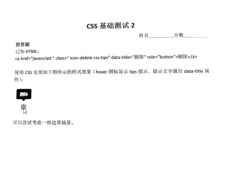
具体实现
我的解答
<!DOCTYPE html>
<html lang="en">

<head>
  <meta charset="UTF-8">
  <meta name="viewport" content="width=device-width, initial-scale=1.0">
  <meta http-equiv="X-UA-Compatible" content="ie=edge">
  <title>Document</title>
  <style>
    body {
      background-color: white;
    }

    .icon-delete {
      position: relative;
      display: inline-block;
      cursor: default;
      margin-top: 30px;
      margin-left: 30px;
      color: #000;
    }

    .css-tips::before {
      visibility: hidden;
      opacity: 0;
      transition: all 0.5s;
      position: absolute;
      left: 50%;
      transform: translateX(-50%);
      content: attr(data-title);
      font-size: 14px;
      background: #000;
      width: max-content;
      /* white-space: nowrap; */
      color: #fff;
      top: -32px;
      border-radius: 4px;
      padding: 4px 8px;
    }

    .css-tips::after {
      visibility: hidden;
      opacity: 0;
      transition: all 0.5s;
      position: absolute;
      left: 50%;
      top: -5px;
      transform: translateX(-50%);
      content: '';
      border: 8px solid transparent;
      border-top-color: #000;
    }

    .css-tips:hover::before,
    .css-tips:hover::after {
      visibility: visible;
      opacity: 1;
    }
  </style>
</head>

<body>
  <a
    href="javascript:"
    class="icon-delete css-tips"
    data-title="删除按钮"
    role="button"
  >
    删除
  </a>
</body>

</html>
最佳解答
<!DOCTYPE html>
<html lang="en">

<head>
  <meta charset="UTF-8">
  <meta name="viewport" content="width=device-width, initial-scale=1.0">
  <meta http-equiv="X-UA-Compatible" content="ie=edge">
  <title>Document</title>
  <style>
    body {
      background-color: white;
    }

    .con {
      display: inline-block;
      margin: 50px 80px;
    }

    .css-tips {
      vertical-align: middle;
      cursor: pointer;
    }

    [data-title] {
      position: relative;
      overflow: visible;
    }

    .css-tips[data-title]:before,
    .css-tips[data-title]:after {
      display: block;
      position: absolute;
      z-index: 1;
      left: 50%;
      bottom: 100%;
      transform: translate(-50%, -20px);
      opacity: 0;
      transition: .15s .15s;
      color: #373c42;
      visibility: hidden;
    }

    .css-tips[data-title]:before {
      content: attr(data-title);
      border-radius: 3px;
      padding: 6px 10px;
      line-height: 18px;
      text-align: left;
      background-color: #373c42;
      color: #fff;
      font-size: 12px;
      font-style: normal;
      white-space: nowrap;
    }

    .css-tips[data-title]:after {
      content: '';
      width: 0;
      height: 0;
      margin-bottom: -12px;
      overflow: hidden;
      border: 6px solid transparent;
      border-top-color: currentColor;
    }

    .css-tips[data-title]:hover:before,
    .css-tips[data-title]:hover:after {
      visibility: visible;
      transform: translate(-50%, -10px);
      opacity: 1;
    }

    /* right */
    .css-tips[data-title][data-title-dir="right"]:before,
    .css-tips[data-title][data-title-dir="right"]:after{
      left: 100%;
      top: 50%;
      bottom: auto;
      transform: translate(20px, -50%);
    }
    .css-tips[data-title][data-title-dir="right"]:after {
      margin: 0;
      margin-left: -12px;
      border-color: transparent;
      border-right-color: currentColor;
    }
    .css-tips[data-title][data-title-dir="right"]:hover:before,
    .css-tips[data-title][data-title-dir="right"]:hover:after {
      visibility: visible;
      transform: translate(10px, -50%);
      opacity: 1;
    }

    /* bottom */
    .css-tips[data-title][data-title-dir="bottom"]:before,
    .css-tips[data-title][data-title-dir="bottom"]:after{
      left: 50%;
      top: 100%;
      bottom: auto;
      transform: translate(-50%, 20px);
    }
    .css-tips[data-title][data-title-dir="bottom"]:after {
      margin: 0;
      margin-top: -12px;
      border-color: transparent;
      border-bottom-color: currentColor;
    }
    .css-tips[data-title][data-title-dir="bottom"]:hover:before,
    .css-tips[data-title][data-title-dir="bottom"]:hover:after {
      visibility: visible;
      transform: translate(-50%, 10px);
      opacity: 1;
    }

    /* left */
    .css-tips[data-title][data-title-dir="left"]:before,
    .css-tips[data-title][data-title-dir="left"]:after{
      left: auto;
      right: 100%;
      top: 50%;
      bottom: auto;
      transform: translate(-20px, -50%);
    }
    .css-tips[data-title][data-title-dir="left"]:after {
      margin: 0;
      margin-right: -12px;
      border-color: transparent;
      border-left-color: currentColor;
    }
    .css-tips[data-title][data-title-dir="left"]:hover:before,
    .css-tips[data-title][data-title-dir="left"]:hover:after {
      visibility: visible;
      transform: translate(-10px, -50%);
      opacity: 1;
    }

    /* muti */
    .css-tips[data-title][data-title-muti]:before {
      width: 150px;
      white-space: normal;
    }

    /* success */
    .css-tips[data-title][data-title-type="success"]:before {
      background-color: #52c41a;
    }
    .css-tips[data-title][data-title-type="success"]:after {
      color:#52c41a;
    }
    /* error */
    .css-tips[data-title][data-title-type="error"]:before {
      background-color: #f5222d;
    }
    .css-tips[data-title][data-title-type="error"]:after {
      color:#f5222d;
    }
    /* warn */
    .css-tips[data-title][data-title-type="warn"]:before {
      background-color: #faad14;
    }
    .css-tips[data-title][data-title-type="warn"]:after {
      color:#faad14;
    }

  </style>
</head>

<body>
  <div class="con">
    <span class="css-tips" data-title="删除删除删除" data-title-dir="up">提示上</span>
  </div>
  <div class="con">
    <span class="css-tips" data-title="删除删除删除" data-title-dir="right">提示右</span>
  </div>
  <div class="con">
    <span class="css-tips" data-title="删除删除删除" data-title-dir="bottom">提示下</span>
  </div>
  <div class="con">
    <span class="css-tips" data-title="删除删除删除" data-title-dir="left">提示左</span>
  </div>
  <br>
  <div class="con">
    <span class="css-tips" data-title="删除删除删除删除删除删除删除删除删除" data-title-dir="right" data-title-muti>多行提示</span>
  </div>
  <br>
  <div class="con">
    <span class="css-tips" data-title="删除删除删除删除" data-title-type="success">温馨提示</span>
  </div>
  <div class="con">
    <span class="css-tips" data-title="删除删除删除" data-title-type="error">危险提示</span>
  </div>
  <div class="con">
    <span class="css-tips" data-title="删除删除删除删除" data-title-type="warn">警告提示</span>
  </div>
</body>

</html>
实现要点
- 考虑各种字号场景,使用 bottom 定位,calc()或者 margin-bottom 微调位置;
- transform 增加-ms-前缀,兼容 IE9;
- 考虑边界场景,例如在浏览器上边缘,或者侧面时候;
- 考虑增加延迟显示,使用 visibility+transition,或者 pointer-events: none(渐进增强);
- 考虑键盘访问,增加:focus 伪类显示。
CSS 测试八
具体实现
我的解答
<!DOCTYPE html>
<html lang="en">

<head>
  <meta charset="UTF-8">
  <meta name="viewport" content="width=device-width, initial-scale=1.0">
  <meta http-equiv="X-UA-Compatible" content="ie=edge">
  <title>Document</title>
  <style>
    body {
      background-color: white;
    }

    .chat-list {
      padding: 4px;
    }

    .chat-item {
      position: relative;
      margin-bottom: 32px;
    }

    .chat-avatar {
      display: inline-block;
      vertical-align: top;
      margin-right: 12px;
    }

    .chat-avatar img {
      border-radius: 50%;
      width: 64px;
      height: 64px;
    }

    .chat-content {
      vertical-align: top;
      display: inline-block;
    }

    .chat-header {
      color: rgb(164, 173, 187);
      font-size: 18px;
      margin-bottom: 6px;
    }

    .chat-bubble {
      border-radius: 4px;
      padding: 12px 18px;
      background: rgb(245, 247, 250);
      position: relative;
      word-break: break-all;
    }

    .friend .chat-bubble::before {
      content: '';
      position: absolute;
      border: solid transparent;
      border-width: 6px 10px;
      border-right-color: rgb(245, 247, 250);
      left: -20px;
      top: 4px;
    }

    .self {
      text-align: right;
    }

    .self .chat-content {
      margin-right: 76px;
    }

    .self .chat-avatar{
      position: absolute;
      right: 0;
      margin: 0;
      margin-left: 12px;
    }

    .self .chat-bubble {
      background: rgb(0, 190, 255);
      color: #fff;
    }

    .self .chat-bubble::before {
      content: '';
      position: absolute;
      border: solid transparent;
      border-width: 6px 10px;
      border-left-color: rgb(0, 190, 255);
      right: -20px;
      top: 4px;
    }
  </style>
</head>

<body>
  <div class="chat-list">
    <div class="chat-item friend">
      <div class="chat-avatar">
        <img src="https://tva4.sinaimg.cn/crop.0.0.750.750.180/75f2b996jw8f6zkdm7qp7j20ku0kudgr.jpg" />
      </div>
      <div class="chat-content">
        <div class="chat-header">
          提案笙 9月30日 21:47
        </div>
        <div class="chat-bubble">
          什么秘密,我觉得你现在跟我说什么都没有意义。333333333333333333333333333333333333333333333333333333333333333333333333333333
        </div>
      </div>
    </div>
    <div class="chat-item friend">
      <div class="chat-avatar">
        <img src="https://tvax4.sinaimg.cn/crop.0.0.512.512.180/6cd7bd09ly8fsnom1e5wtj20e80e8gm7.jpg" />
      </div>
      <div class="chat-content">
        <div class="chat-header">
          淮南王铃 10月8日 10:30
        </div>
        <div class="chat-bubble">
          @蝴蝶蓝 优秀
        </div>
      </div>
    </div>
    <div class="chat-item friend">
      <div class="chat-avatar">
        <img src="https://tvax4.sinaimg.cn/crop.0.0.512.512.180/6cd7bd09ly8fsnom1e5wtj20e80e8gm7.jpg" />
      </div>
      <div class="chat-content">
        <div class="chat-header">
          蝴蝶蓝 昨天 22::13
        </div>
        <div class="chat-bubble">
          值得一听~~
        </div>
      </div>
    </div>
    <div class="chat-item self">
      <div class="chat-avatar">
        <img src="https://tvax4.sinaimg.cn/crop.0.0.512.512.180/6cd7bd09ly8fsnom1e5wtj20e80e8gm7.jpg" />
      </div>
      <div class="chat-content">
        <div class="chat-header">
          刚刚 Y优秀X
        </div>
        <div class="chat-bubble">
          围观戏精现场
        </div>
      </div>
    </div>
  </div>
</body>

</html>
有几个缺点,宽度较小时会换行,消息气泡不够还原
relative + absolute + box-shadow
<!DOCTYPE html>
<html lang="en">

<head>
  <meta charset="UTF-8">
  <meta name="viewport" content="width=device-width, initial-scale=1.0">
  <meta http-equiv="X-UA-Compatible" content="ie=edge">
  <title>Document</title>
  <style>
    body,
    html {
      background-color: white;
      font-size: 15px;
    }

    .chat-item {
      position: relative;
      min-height: 4rem;
      /* 预留空间给头像 */
      padding: .5rem 4rem;
    }

    .chat-item .chat-header {
      font-size: .8rem;
      color: rgb(163, 171, 184);
    }

    .chat-item .chat-avatar > img {
      height: 100%;
    }

    .chat-item .chat-avatar {
      position: absolute;
      top: .5rem;
      overflow: hidden;
      width: 3rem;
      height: 3rem;
      border-radius: 50%;
    }

    .chat-item.friend .chat-avatar {
      left: .5rem;
    }

    .chat-item.self .chat-avatar {
      right: .5rem;
    }

    .chat-item.self {
      text-align: right;
    }

    .chat-item .chat-bubble {
      line-height: 1.5;
      position: relative;
      display: inline-block;
      margin: .25rem 0;
      padding: .6rem 1rem;
      border-radius: .5rem;
    }

    .chat-item.friend .chat-bubble{
      background: rgb(245, 247, 250);
    }

    .chat-item.self .chat-bubble{
      color: #fff;
      background: rgb(82, 188, 250);
    }

    .chat-item .chat-bubble::before {
      position: absolute;
      top: .02rem;
      width: 1.2rem;
      height: 1rem;
      content: '';
      border-radius: 50% 50% 0 0;
    }

    .chat-item.friend .chat-bubble::before {
      left: -1.2rem;
      /* 阴影处作为实际的小尾巴 */
      box-shadow: .5rem 0 0 0 rgb(245, 247, 250);
    }

    .chat-item.self .chat-bubble::before {
      right: -1.2rem;
      box-shadow: -.5rem 0 0 0 rgb(82, 188, 250);
    }
  </style>
</head>

<body>
  <div class="chat-list">
    <div class="chat-item friend">
      <div class="chat-avatar">
        <img src="https://tva4.sinaimg.cn/crop.0.0.750.750.180/75f2b996jw8f6zkdm7qp7j20ku0kudgr.jpg" />
      </div>
      <div class="chat-header">
        提案笙 9月30日 21:47
      </div>
      <div class="chat-bubble">
        什么秘密,我觉得你现在跟我说什么都没有意义。333333333333333333333333333333333333333333333333333333333333333333333333333333
      </div>
    </div>
    <div class="chat-item friend">
      <div class="chat-avatar">
        <img src="https://tvax4.sinaimg.cn/crop.0.0.512.512.180/6cd7bd09ly8fsnom1e5wtj20e80e8gm7.jpg" />
      </div>
      <div class="chat-header">
        淮南王铃 10月8日 10:30
      </div>
      <div class="chat-bubble">
        @蝴蝶蓝 优秀
      </div>
    </div>
    <div class="chat-item friend">
      <div class="chat-avatar">
        <img src="https://tvax4.sinaimg.cn/crop.0.0.512.512.180/6cd7bd09ly8fsnom1e5wtj20e80e8gm7.jpg" />
      </div>
      <div class="chat-header">
        蝴蝶蓝 昨天 22::13
      </div>
      <div class="chat-bubble">
        值得一听~~
      </div>
    </div>
    <div class="chat-item self">
      <div class="chat-avatar">
        <img src="https://tvax4.sinaimg.cn/crop.0.0.512.512.180/6cd7bd09ly8fsnom1e5wtj20e80e8gm7.jpg" />
      </div>
      <div class="chat-header">
        刚刚 Y优秀X
      </div>
      <div class="chat-bubble">
        围观戏精现场
      </div>
    </div>
  </div>
</body>

</html>
flex + flex: 1 + border-radius + direction: rtl
<!DOCTYPE html>
<html lang="en">

<head>
  <meta charset="UTF-8">
  <meta name="viewport" content="width=device-width, initial-scale=1.0">
  <meta http-equiv="X-UA-Compatible" content="ie=edge">
  <title>Document</title>
  <style>
    html,
    body {
      background-color: white;
      margin: 0;
      height: 100%;
    }

    .msg-list {
      height: 100%;
      overflow: auto;
      list-style: none;
      margin: 0;
      padding: 0;
    }

    .msg-item {
      display: flex;
      padding: 7px;
      margin-bottom: 15px;
    }

    .msg-item::after {
      content: '';
      display: inline-block;
      width: 44px;
    }

    .msg-avator {
      width: 44px;
      height: 44px;
      border-radius: 50%;
      object-fit: cover;
    }

    .msg-info {
      flex: 1;
      text-align: start;
      padding: 0 10px;
      overflow: hidden;
    }

    .msg-user {
      margin: 0;
      font-weight: normal;
      font-size: 13px;
      color: #949ead;
    }

    .msg-user span {
      display: inline-block;
    }

    .msg-time {
      padding: 0 8px;
    }

    .msg-txt {
      position: relative;
      display: inline-flex;
      background: #f2f5f9;
      border-color: #f2f5f9;
      font-size: 14px;
      line-height: 1.5;
      color: #2c3038;
      padding: .6em 1em;
      text-align: left;
      margin: 5px 0 0;
      border-radius: 6px;
    }

    .msg-txt::before {
      content: '';
      position: absolute;
      width: 1.4em;
      height: 1.2em;
      top: 0;
      margin-inline-start: -3em;
      -webkit-margin-start: -3em; /**qq浏览器有点兼容性问题,需要加上这个**/
      border-top-right-radius: 40% 50%;
      border-top-left-radius: 40% 50%;
      border-left: 0.6em solid;
      border-right: 0.6em solid;
      border-color: inherit;
    }

    /** data-self(message from myself) **/
    .msg-item[data-self] {
      direction: rtl;/*改变css流向*/
    }

    .msg-item[data-self] .msg-txt {
      background: #00afff;
      border-color: #00afff;
      color: #fff;
    }
  </style>
</head>

<body>
  <ul class="msg-list">
    <li class="msg-item">
      <img class="msg-avator" alt="head" src="https://tva4.sinaimg.cn/crop.0.0.750.750.180/75f2b996jw8f6zkdm7qp7j20ku0kudgr.jpg" >
      <div class="msg-info">
        <h3 class="msg-user">
          <span class="msg-name">提按生</span>
          <span class="msg-time">9月30日 21:47</span>
        </h3>
        <p class="msg-txt">什么秘密什么秘密什么秘密什么秘密什么秘密什么秘密什么秘密什么秘密什么秘密</p>
      </div>
    </li>
    <li class="msg-item">
      <img class="msg-avator" alt="head" src="https://tvax4.sinaimg.cn/crop.0.0.512.512.180/6cd7bd09ly8fsnom1e5wtj20e80e8gm7.jpg" >
      <div class="msg-info">
        <h3 class="msg-user">
          <span class="msg-name">提按生</span>
          <span class="msg-time">9月30日 21:47</span>
        </h3>
        <p class="msg-txt">什么秘密</p>
      </div>
    </li>
    <li class="msg-item" data-self>
      <img class="msg-avator" alt="head" src="https://tvax3.sinaimg.cn/crop.135.0.810.810.180/006LO43wly8frjay2sypvj30u00mita5.jpg" >
      <div class="msg-info">
        <h3 class="msg-user">
          <span class="msg-name">提按生</span>
          <span class="msg-time">9月30日 21:47</span>
        </h3>
        <p class="msg-txt">什么秘密什么秘密什么秘密什么秘密什么秘密什么秘密什么秘密什么秘密什么秘密什么秘密什么秘密什么秘密什么秘密</p>
      </div>
    </li>
    <li class="msg-item">
      <img class="msg-avator" alt="head" src="https://tva1.sinaimg.cn/crop.0.0.750.750.180/006bQeGsjw8f1tgl7z9ncj30ku0kuq44.jpg" >
      <div class="msg-info">
        <h3 class="msg-user">
          <span class="msg-name">提按生</span>
          <span class="msg-time">9月30日 21:47</span>
        </h3>
        <p class="msg-txt">什么秘密</p>
      </div>
    </li>
  </ul>
</body>

</html>
实现要点
- 基准字号使用 16px,不用其它像素值。也不用使用 100px。
- media 查询和 vw 技巧实现 html 基础尺寸动态化(无需 JS)。
- 要有统一的类名命名空间,类似 chat-。
- 遇到不同性质的命名,通常两种方式。1. 类名,但是命名上明显区分,例如 chat-item__left。2. 使用属性选择器。
- 避免没必要的嵌套,百害无一益。
- 小尾巴的实现。边框+圆角,box-shadow+圆角,径向渐变
- 左右对称布局的实现:direction: rtl 配合 CSS 逻辑属性
- 不推荐使用 dl 标签,可以给每个列表增加 tabindex=0
CSS 测试九
具体实现
最佳解答
<!DOCTYPE html>
<html lang="en">

<head>
  <meta charset="UTF-8">
  <meta name="viewport" content="width=device-width, initial-scale=1.0">
  <meta http-equiv="X-UA-Compatible" content="ie=edge">
  <title>Document</title>
  <style>
    html,
    body {
      background-color: white;
      margin: 0;
      height: 100%;
    }
  </style>
</head>

<body>
  <form action="">
    <h3>登录</h3>
    <div>
      <input required type="text" placeholder="账户/手机" autocomplete="off" autofocus />
    </div>
    <div>
      <input required type="password" placeholder="密码" autocomplete="off" />
      <a href="/forget">忘记密码?</a>
    </div>
    <div>
      <input required type="text" placeholder="验证码" />
      <img src="" alt="验证码" />
    </div>
    <div>
      <button type="submit">登录</button>
    </div>
    <div>
      <a href='/reg'>立即注册</a>
    </div>
  </form>
</body>

</html>
实现要点
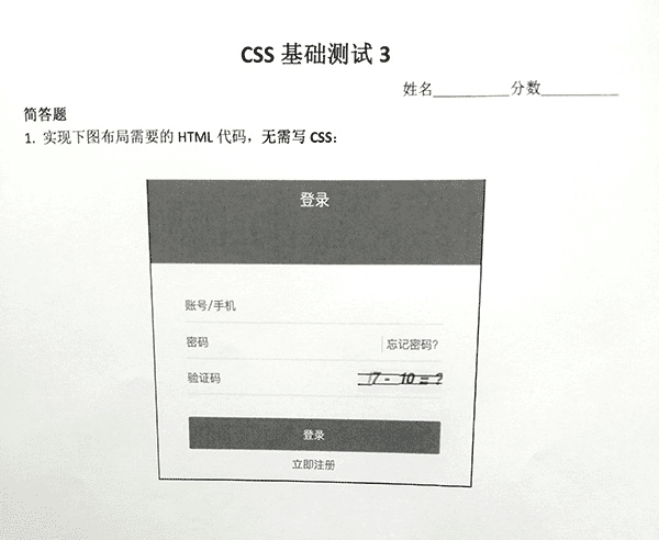
<form>+ submit<fieldset>+<legend>- placeholder
- name
- required 验证
- autocomplete=“off”
- tabindex/autofocus
- type=“text”可以缺省
- 忘记密码,立即注册最好使用
<a>
CSS 测试十
具体实现
details > summary
<!DOCTYPE html>
<html lang="en">

<head>
  <meta charset="UTF-8">
  <meta name="viewport" content="width=device-width, initial-scale=1.0">
  <meta http-equiv="X-UA-Compatible" content="ie=edge">
  <title>Document</title>
  <style>
    html,
    body {
      background-color: white;
      margin: 0;
      height: 100%;
    }

    ::-webkit-details-marker {
      display: none;
    }

    ::-moz-list-bullet {
      font-size: 0;
    }

    .ui-menu-wrap {
      width: 200px;
    }

    summary {
      outline: 0;
    }

    .ui-btn {
      line-height: 40px;
      padding: 0 25px;
      font-size: 14px;
      color: #666;
      transition: .3s;
      cursor: pointer;
    }

    .ui-btn:hover {
      background: #edf9ff;
      color: #33b2ee;
    }

    .ui-menu-list .ui-btn {
      display: block;
    }

    .ui-menu-summary {
      position: relative;
      padding: 0 10px;
      line-height: 40px;
      color: #333;
      font-size: 14px;
      font-weight: bold;
      cursor: pointer;
    }

    .ui-menu-summary::after {
      content: '';
      position: absolute;
      right: 10px;
      top: 50%;
      margin-top: 3px;
      width: 6px;
      height: 6px;
      border: 2px solid;
      border-width: 2px 2px 0 0;
      transform: translateY(-8px) rotate(135deg);
      transition: .3s;
    }

    .ui-menu[open] .ui-menu-summary::after {
      transform: translateY(-8px) rotate(-45deg);
    }
  </style>
</head>

<body>
  <div class="ui-menu-wrap">
    <details class="ui-menu" open>
      <summary class="ui-menu-summary">布局</summary>
      <div class="ui-menu-list">
        <a class="ui-btn">Flex 布局</a>
        <a class="ui-btn">Grid 布局</a>
        <a class="ui-btn">Shapes 布局</a>
        <a class="ui-btn">Flex 布局</a>
        <a class="ui-btn">Flex 布局</a>
      </div>
    </details>
    <details class="ui-menu" open>
      <summary class="ui-menu-summary">组件</summary>
      <div class="ui-menu-list">
        <a class="ui-btn">按钮</a>
        <a class="ui-btn">输入框</a>
        <a class="ui-btn">下拉列表</a>
        <a class="ui-btn">单选框</a>
      </div>
    </details>
  </div>
</body>

</html>
checkbox
<!DOCTYPE html>
<html lang="en">

<head>
  <meta charset="UTF-8">
  <meta name="viewport" content="width=device-width, initial-scale=1.0">
  <meta http-equiv="X-UA-Compatible" content="ie=edge">
  <title>Document</title>
  <style>
    html,
    body {
      background-color: white;
      margin: 0;
      height: 100%;
    }

    .ui-menu-wrap {
      width: 200px;
    }

    .ui-btn {
      line-height: 40px;
      padding: 0 25px;
      font-size: 14px;
      color: #666;
      transition: .3s;
      cursor: pointer;
    }

    .ui-btn:hover {
      background: #edf9ff;
      color: #33b2ee;
    }

    .ui-menu-list .ui-btn {
      display: block;
    }

    .ui-menu-summary {
      display: block;
      position: relative;
      line-height: 40px;
      padding: 0 10px;
      color: #333;
      font-size: 14px;
      font-weight: bold;
      cursor: pointer;
      transition: .3s;
      user-select: none;
    }

    .ui-menu-summary:focus {
      background: #edf9ff;
    }

    .ui-menu-summary::after {
      content: '';
      position: absolute;
      right: 10px;
      top: 50%;
      margin-top: 3px;
      width: 6px;
      height: 6px;
      border: 2px solid;
      border-width: 2px 2px 0 0;
      transform: translateY(-10px) rotate(135deg);
      transition: .3s;
    }

    .ui-menu-list {
      display: none;
    }

    .ui-menu > input[type="checkbox"]:checked + .ui-menu-summary::after {
      transform: translateY(-8px) rotate(-45deg);
    }

    .ui-menu > input[type="checkbox"] {
      /* 满足视觉上的隐藏,屏幕阅读设备等辅助设备也支持得很好。*/
      position: absolute;
      clip: rect(0, 0, 0, 0);
    }

    .ui-menu > input[type="checkbox"]:checked + .ui-menu-summary + .ui-menu-list {
      display: block;
    }
  </style>
</head>

<body>
  <div class="ui-menu-wrap">
    <div class="ui-menu">
      <input type="checkbox" id="menu01" checked>
      <label class="ui-menu-summary" for="menu01">布局1</label>
      <div class="ui-menu-list">
        <a class="ui-btn">Flex 布局</a>
        <a class="ui-btn">Grid 布局</a>
        <a class="ui-btn">Shapes 布局</a>
        <a class="ui-btn">Flex 布局</a>
        <a class="ui-btn">Flex 布局</a>
      </div>
    </div>
    <div class="ui-menu">
      <input type="checkbox" id="menu02" checked>
      <label class="ui-menu-summary" for="menu02">布局2</label>
      <div class="ui-menu-list">
        <a class="ui-btn">Flex 布局</a>
        <a class="ui-btn">Grid 布局</a>
        <a class="ui-btn">Shapes 布局</a>
        <a class="ui-btn">Flex 布局</a>
        <a class="ui-btn">Flex 布局</a>
      </div>
    </div>
  </div>
</body>

</html>
target
<!DOCTYPE html>
<html lang="en">

<head>
  <meta charset="UTF-8">
  <meta name="viewport" content="width=device-width, initial-scale=1.0">
  <meta http-equiv="X-UA-Compatible" content="ie=edge">
  <title>Document</title>
  <style>
    html,
    body {
      background-color: white;
      margin: 0;
      height: 100%;
    }

    .ui-menu-wrap {
      width: 200px;
    }

    .ui-btn {
      line-height: 40px;
      padding: 0 25px;
      font-size: 14px;
      color: #666;
      transition: .3s;
      cursor: pointer;
    }

    .ui-btn:hover {
      background: #edf9ff;
      color: #33b2ee;
    }

    .ui-menu-list .ui-btn {
      display: block;
    }

    .ui-menu-summary {
      display: block;
      position: relative;
      line-height: 40px;
      padding: 0 10px;
      color: #333;
      font-size: 14px;
      font-weight: bold;
      cursor: pointer;
      transition: .3s;
      user-select: none;
      text-decoration: none;
    }

    .ui-menu-summary:focus {
      background: #edf9ff;
    }

    .ui-menu-summary::after {
      content: '';
      position: absolute;
      right: 10px;
      top: 50%;
      margin-top: 3px;
      width: 6px;
      height: 6px;
      border: 2px solid;
      border-width: 2px 2px 0 0;
      transform: translateY(-10px) rotate(135deg);
      transition: .3s;
    }

    .ui-menu-list {
      display: none;
    }

    .ui-menu-summary:target::after {
      transform: translateY(-8px) rotate(-45deg);
    }

    .ui-menu-summary:target + .ui-menu-list {
      display: block;
    }
  </style>
</head>

<body>
  <div class="ui-menu-wrap">
    <div class="ui-menu">
      <a class="ui-menu-summary" id="menu01" href="#menu01">布局</a>
      <div class="ui-menu-list">
        <a class="ui-btn">Flex 布局</a>
        <a class="ui-btn">Grid 布局</a>
        <a class="ui-btn">Shapes 布局</a>
        <a class="ui-btn">Flex 布局</a>
        <a class="ui-btn">Flex 布局</a>
      </div>
    </div>
    <div class="ui-menu">
      <a class="ui-menu-summary" id="menu02" href="#menu02">组件</a>
      <div class="ui-menu-list">
        <a class="ui-btn">按钮</a>
        <a class="ui-btn">输入框</a>
        <a class="ui-btn">下拉列表</a>
        <a class="ui-btn">单选框</a>
      </div>
    </div>
  </div>
</body>

</html>
focus-within
<!DOCTYPE html>
<html lang="en">

<head>
  <meta charset="UTF-8">
  <meta name="viewport" content="width=device-width, initial-scale=1.0">
  <meta http-equiv="X-UA-Compatible" content="ie=edge">
  <title>Document</title>
  <style>
    html,
    body {
      background-color: white;
      margin: 0;
      height: 100%;
    }

    .ui-menu-wrap {
      width: 200px;
    }

    .ui-btn {
      line-height: 40px;
      padding: 0 25px;
      font-size: 14px;
      border: 0;
      width: 100%;
      background: none;
      outline: 0;
      text-align: left;
      color: #666;
      transition: .3s;
      cursor: pointer;
    }

    .ui-btn:hover {
      background: #edf9ff;
      color: #33b2ee;
    }

    .ui-menu-list .ui-btn {
      display: block;
    }

    .ui-menu-summary {
      display: block;
      position: relative;
      line-height: 40px;
      padding: 0 10px;
      color: #333;
      font-size: 14px;
      font-weight: bold;
      border: 0;
      width: 100%;
      background: none;
      cursor: pointer;
      outline: 0;
      text-align: left;
      transition: .3s;
      user-select: none;
      text-decoration: none;
    }

    .ui-menu-summary:focus {
      /* 从可获焦元素开始一直冒泡到根元素 html,都可以接收触发 :focus-within 事件 */
      background: #edf9ff;
    }

    .ui-menu-summary::after {
      content: '';
      position: absolute;
      right: 10px;
      top: 50%;
      margin-top: 3px;
      width: 6px;
      height: 6px;
      border: 2px solid;
      border-width: 2px 2px 0 0;
      transform: translateY(-10px) rotate(135deg);
      transition: .3s;
    }

    .ui-menu-list {
      display: none;
    }

    .ui-menu:focus-within .ui-menu-summary::after {
      transform: translateY(-8px) rotate(-45deg);
    }

    .ui-menu:focus-within .ui-menu-list {
      display: block;
    }
  </style>
</head>

<body>
  <div class="ui-menu-wrap">
    <div class="ui-menu">
      <button class="ui-menu-summary">布局</button>
      <div class="ui-menu-list">
        <button class="ui-btn">Flex 布局</button>
        <button class="ui-btn">Grid 布局</button>
        <button class="ui-btn">Shapes 布局</button>
        <button class="ui-btn">Flex 布局</button>
        <button class="ui-btn">Flex 布局</button>
      </div>
    </div>
    <div class="ui-menu">
      <button class="ui-menu-summary">组件</button>
      <div class="ui-menu-list">
        <button class="ui-btn">按钮</button>
        <button class="ui-btn">输入框</button>
        <button class="ui-btn">下拉列表</button>
        <button class="ui-btn">单选框</button>
      </div>
    </div>
  </div>
</body>

</html>
实现要点
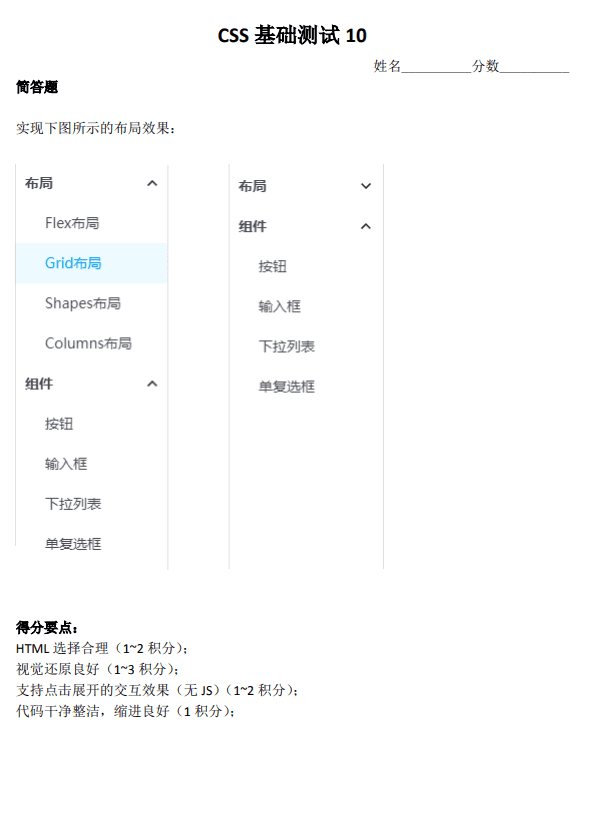
- 视觉还原才是重点。
- details > summary 是最好的实现。可以进一步注意语义化。这个方法 IE/Edge 是不支持。所以可以用来判断是否是 IE 内核浏览器,var isIE = !(‘open’ in document.createElement(‘details’))。所以如果要兼容 IE,可以写个 polyfill。
- :checked 方法交互也可以实现,但语义欠佳,不是这种交互的最佳实践。注意优化选择器。
- :target 方法有触发锚点定位的问题,可以使用一个隐藏的空 div 元素曲线救国。
- :focus-within 只要子元素有 focus,就能匹配。是目前最先支持的具有“父选择器”特性的伪类。最佳实践是下拉菜单。类似的选择器还有 :target-within。
- 元素聚焦,同时聚焦轮廓浏览器认为应该显示。:focus:not(:focus-visible) { outline: 0; }
- 注意不要过度无障碍设置
CSS 测试十一
实现思路与 CSS 测试六基本一致
具体实现
float: left + overflow: hidden(我的实现)
<!DOCTYPE html>
<html lang="en">

<head>
  <meta charset="UTF-8">
  <meta name="viewport" content="width=device-width, initial-scale=1.0">
  <meta http-equiv="X-UA-Compatible" content="ie=edge">
  <title>Document</title>
  <style>
    html,
    body {
      background-color: white;
      margin: 0;
      height: 100%;
    }

    .article {
      background: rgb(255, 248, 220);
      border: 1px solid #eee;
      border-radius: 5px;
      width: 300px;
    }

    .title {
      padding: 14px;
      font-size: 14px;
      background: rgb(247, 241, 213);
      border-bottom: 1px solid #eee;
    }

    .item {
      padding: 12px 18px;
      overflow: hidden;
    }

    .item:not(:last-child) {
      border-bottom: 1px solid #eee;
    }

    .item .content {
      overflow: hidden;
      display: -webkit-box;
      -webkit-box-orient: vertical;
      -webkit-line-clamp: 2;
    }

    .item a {
      text-decoration: none;
    }

    .icon {
      float: left;
      width: 16px;
      margin-right: 6px;
    }

    .icon::before {
      content: '';
      display: inline-block;
      width: 16px;
      height: 16px;
      position: relative;
      top: 3px;
    }

    .icon-book::before {
      background-image: url("data:image/svg+xml,%3Csvg xmlns='http://www.w3.org/2000/svg' viewBox='0 0 576 512'%3E %3Cpath fill='%23828380' d='M567.403 235.642L462.323 84.589A48 48 0 0 0 422.919 64H153.081a48 48 0 0 0-39.404 20.589L8.597 235.642A48.001 48.001 0 0 0 0 263.054V400c0 26.51 21.49 48 48 48h480c26.51 0 48-21.49 48-48V263.054c0-9.801-3-19.366-8.597-27.412zM153.081 112h269.838l77.913 112H75.168l77.913-112zM528 400H48V272h480v128zm-32-64c0 17.673-14.327 32-32 32s-32-14.327-32-32 14.327-32 32-32 32 14.327 32 32zm-96 0c0 17.673-14.327 32-32 32s-32-14.327-32-32 14.327-32 32-32 32 14.327 32 32z'%3E%3C/path%3E %3C/svg%3E");
    }

    .icon-discuss::before {
      background-image: url("data:image/svg+xml,%3Csvg xmlns='http://www.w3.org/2000/svg' viewBox='0 0 512 512'%3E %3Cpath fill='%232d82ce' d='M448 0H64C28.7 0 0 28.7 0 64v288c0 35.3 28.7 64 64 64h96v84c0 7.1 5.8 12 12 12 2.4 0 4.9-.7 7.1-2.4L304 416h144c35.3 0 64-28.7 64-64V64c0-35.3-28.7-64-64-64zm16 352c0 8.8-7.2 16-16 16H288l-12.8 9.6L208 428v-60H64c-8.8 0-16-7.2-16-16V64c0-8.8 7.2-16 16-16h384c8.8 0 16 7.2 16 16v288z'%3E%3C/path%3E %3C/svg%3E");
    }
  </style>
</head>

<body>
  <div class="article">
    <div class="title">
      标题
    </div>
    <div class="body">
      <div class="item">
        <div class="icon icon-discuss"></div>
        <div class="content">
          <a href="#">
            恭喜我们29个最老的测试版网站-他们现在不再是测试版了!
          </a>
        </div>
      </div>
      <div class="item">
        <div class="icon icon-discuss"></div>
        <div class="content">
          <a href="#">
            《独角兽动物园》35;7:Nicolas访谈
          </a>
        </div>
      </div>
      <div class="item">
        <div class="icon icon-book"></div>
        <div class="content">
          <a href="#">
            减少需要重新审查的封闭问题数量的建议
          </a>
        </div>
      </div>
      <div class="item">
        <div class="icon icon-book"></div>
        <div class="content">
          <a href="#">
            实验:在接下来的30天内(直到2019-09-07),以3票为基准关闭和重新打开提出的问题
          </a>
        </div>
      </div>
    </div>
  </div>
</body>

</html>
background-position
<!DOCTYPE html>
<html lang="en">
<head>
<meta charset="UTF-8">
<meta name="viewport" content="width=device-width, initial-scale=1.0">
<meta http-equiv="X-UA-Compatible" content="ie=edge">
<title>Document</title>
<style>
html,
body {
background-color: white;
margin: 0;
height: 100%;
}
.ui-content {
width: 300px;
font-size: 12px;
border: 1px solid #e6dfc6;
}
.ui-title {
font-size: inherit;
color: #737063;
margin: 0;
padding: 1em 1.2em;
background: #f7f1d5;
}
.ui-list {
list-style: none;
margin: 0;
padding: 0;
background: #fff8dc;
}
.ui-item {
border-top: 1px solid #ede7cd;
padding: 1em 1.2em;
line-height: 1.4;
}
.ui-link {
display: block;
display: -webkit-box;
text-decoration: none;
color: #0077cc;
overflow: hidden;
-webkit-box-orient: vertical;
-webkit-line-clamp: 2;
max-height: 2.8em;
}
.ui-item[type] {
padding-left: 2.7em;
background-position: 1em 1em;
background-repeat: no-repeat;
background-size: 1.2em 1.2em;
}
.ui-item[type="msg"] {
background-image: url("data:image/svg+xml,%3Csvg class='icon' viewBox='0 0 1024 1024' xmlns='http://www.w3.org/2000/svg' width='200' height='200'%3E%3Cpath d='M892.3 925.3c-15.5 0-30.5-6.5-41.4-18.6L759.7 805l-.6-.8c-2.7-3.3-6.6-5.2-10.9-5.2H232.1C146.6 799 77 729.5 77 643.9V233.6c0-85.5 69.6-155.1 155.1-155.1h559c85.5 0 155.1 69.6 155.1 155.1v453.8c0 27.7 1.4 125.3 2.2 181.1.3 23.5-13.6 44.3-35.5 52.9-6.7 2.6-13.7 3.9-20.6 3.9zm-15.9-55.8s0 .1 0 0c0 .1 0 0 0 0zm-61.9-111.2l61.3 68.3c-.8-58-1.6-117.8-1.6-139.1V233.6c0-22.1-8.7-42.9-24.4-58.7-15.8-15.8-36.6-24.4-58.7-24.4h-559c-22.1 0-42.9 8.7-58.7 24.4-15.8 15.8-24.4 36.6-24.4 58.7v410.3c0 22.1 8.7 42.9 24.4 58.7 15.8 15.8 36.6 24.4 58.7 24.4h516.1c25.8 0 49.9 11.4 66.3 31.3z' fill='%2346a2d9'/%3E%3Cpath d='M763.5 373.6H274c-19.9 0-36-16.1-36-36s16.1-36 36-36h489.4c19.9 0 36 16.1 36 36s-16.1 36-35.9 36zM590.1 550.2H274c-19.9 0-36-16.1-36-36s16.1-36 36-36h316c19.9 0 36 16.1 36 36 .1 19.8-16 36-35.9 36z' fill='%2346a2d9'/%3E%3C/svg%3E")
}
.ui-item[type="exp"] {
background-image: url("data:image/svg+xml,%3Csvg class='icon' viewBox='0 0 1024 1024' xmlns='http://www.w3.org/2000/svg' width='200' height='200'%3E%3Cpath d='M810.07 932.907V659.669h91.05V1024H78.677V659.67h90.88v273.237H810.07zm-549.334-91.051h458.197v-91.179H260.736v91.179zm11.05-207.019l447.147 93.398 19.243-88.32-447.061-93.312-19.328 88.234zm57.985-215.722l414.08 193.28 38.528-83.2-414.123-193.28-38.485 82.602v.598zm115.84-204.16l350.592 292.48 57.984-69.12-350.55-292.395-57.6 68.992-.426.043zM672.043 0l-74.496 55.21 273.28 367.105 74.496-55.211L671.957 0h.086z' fill='%2352575c'/%3E%3C/svg%3E")
}
</style>
</head>
<body>
<section class="ui-content">
<h2 class="ui-title">标题</h2>
<ul class="ui-list">
<li class="ui-item" type="msg">
<a class="ui-link" href="#">恭喜我们29个最老的测试版网站-他们现在不再是测试版了!</a>
</li>
<li class="ui-item" type="msg">
<a class="ui-link" href="#">《独角兽动物园》35;7:Nicolas访谈</a>
</li>
<li class="ui-item" type="exp">
<a class="ui-link" href="#">减少需要重新审查的封闭问题数量的建议</a>
</li>
<li class="ui-item" type="exp">
<a class="ui-link" href="#">实验:在接下来的30天内(直到2019-09-07),以3票为基准关闭和重新打开提出的问题</a>
</li>
</ul>
</section>
</body>
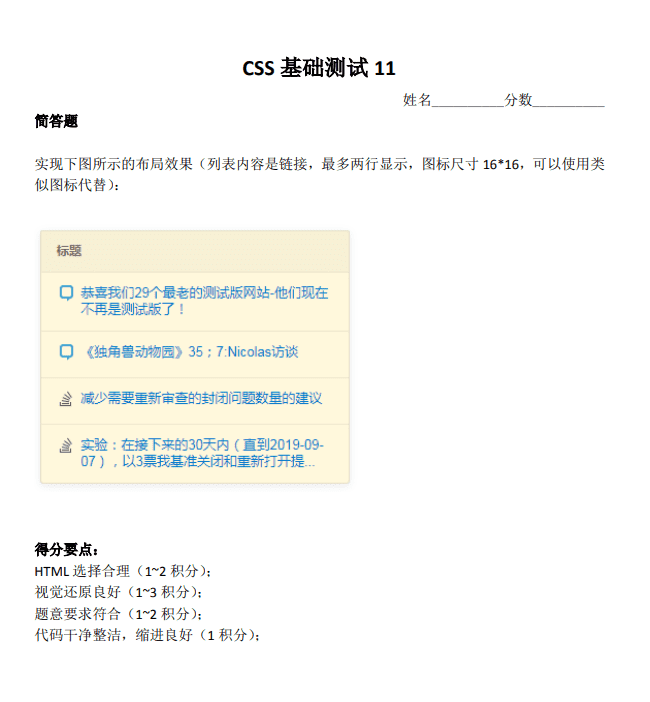
</html>实现要点
- 关于 HTML 语义:article 用在非常大段的完整的描述内容上。header 是表示非常完整的整页的头部,不是具体某一两个标题头。对于一个文字列表的标题,级别 h3~h6 之间,通常是 h3, h4(概率更大)。链接,一定要使用元素。
- 还是关于 HTML 语义:dl>dt+dd 这里也是不合适的,虽然也是列表,但是这个是“定义列表(define list)>定义标题+定义描述”,这个一般用在对特定描述的解释上。比方说 JS API 解释。
- 就是关于链接的区域,应该 wrap 整个列表。为了和移动端的交互体验保持一致(方便胡萝卜一样的粗的手指可以精准点击)。a 元素里面是可以放置块状元素的。比较好的 HTML 语义结构应该是:section>h4+ul>li>a
- 两栏自适应布局,之前有小测,这里就不重复展开,但是,要介绍一个比较有意思的实现:liyongleihf2006,使用 text-indent 负值,这个场景是相当合适的。
- 多行打点:display: -webkit-box; -webkit-box-orient: vertical; -webkit-line-clamp: 2; 多行打点 overflow:hidden 不是必需的,和单行 ellipsis 不一样。然后可能有些小伙伴不知道的是:Firefox 目前也支持了-webkit-box 打点。
- 关于固有宽度,固有比例。这个《CSS 世界》有介绍,在 content 内容生成那里 url(xxx.png)。list-style-image: url(icon.svg)也是一样的,CSS 的 width/height 是无法控制图片的尺寸的。
CSS 测试十二
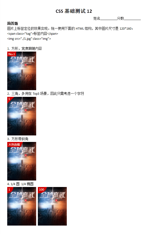
具体实现
我的实现
<!DOCTYPE html>
<html lang="en">

<head>
  <meta charset="UTF-8">
  <meta name="viewport" content="width=device-width, initial-scale=1.0">
  <meta http-equiv="X-UA-Compatible" content="ie=edge">
  <title>Document</title>
  <style>
    html,
    body {
      background-color: white;
      margin: 0;
      height: 100%;
    }

    .img {
      width: 120px;
    }

    .item {
      margin-bottom: 36px;
    }

    .tag {
      position: absolute;
      color: white;
    }

    .block {
      padding: 2px;
      font-size: 12px;
      background: red;
    }

    .triangle {
      width: 28px;
      height: 28px;
      font-size: 12px;
      padding: 2px 4px;
      /* 0deg对应着垂直方向即to top,默认值为to bottom即180deg,顺时针增加; */
      background: linear-gradient(135deg, red 50%, transparent 0);
    }

    .block-triangle {
      width: 60px;
      height: 18px;
      padding: 2px 4px;
      font-size: 12px;
      /* 0deg对应着垂直方向即to top,默认值为to bottom即180deg,顺时针增加; */
      background: linear-gradient(110deg, red calc(100% - 12px), transparent 0);
    }

    .circle {
      width: 20px;
      height: 20px;
      border-bottom-right-radius: 20px;
      padding-left: 4px;
      padding-top: 4px;
      font-size: 12px;
      background: red;
    }

    .ellipse {
      width: 25px;
      height: 20px;
      border-bottom-right-radius: 15px;
      font-size: 12px;
      background: red;
    }
  </style>
</head>
<body>
  <div class="item">
    <span class="tag block">No.1</span>
    <img
      src="../../images/2019-09-26-19-49-51.png"
      alt="头像"
      class="img"
    />
  </div>

  <div class="item">
    <span class="tag triangle">1</span>
    <img
      src="../../images/2019-09-26-19-49-51.png"
      alt="头像"
      class="img"
    />
  </div>

  <div class="item">
    <span class="tag block-triangle">火热连载</span>
    <img
      src="../../images/2019-09-26-19-49-51.png"
      alt="头像"
      class="img"
    />
  </div>

  <div class="item">
    <span class="tag circle">1</span>
    <img
      src="../../images/2019-09-26-19-49-51.png"
      alt="头像"
      class="img"
    />
  </div>

  <div class="item">
    <span class="tag ellipse">100</span>
    <img
      src="../../images/2019-09-26-19-49-51.png"
      alt="头像"
      class="img"
    />
  </div>
</body>

</html>
最佳实现一
<!DOCTYPE html>
<html lang="en">

<head>
  <meta charset="UTF-8">
  <meta name="viewport" content="width=device-width, initial-scale=1.0">
  <meta http-equiv="X-UA-Compatible" content="ie=edge">
  <title>Document</title>
  <style>
    html,
    body {
      background-color: white;
      margin: 0;
      height: 100%;
    }

    .tag {
      position: absolute;
      color: white;
      background: #cd0000;
      font-size: 12px;
    }

    .img {
      width: 120px;
      height: 160px;
    }

    .tag[type="square"] {
      padding: 0.1em .5em;
    }

    .tag[type="triangle"] {
      width: 2.5em;
      height: 2.5em;
      background: linear-gradient(to right bottom, #cd0000 50%, transparent 50%);
      text-indent: .5em;
    }

    .tag[type="trapezoidal"] {
      padding: .1em 3em .1em .5em;
      background: linear-gradient(135deg, #cd0000 calc(100% - 2em), transparent 2em);
    }

    .tag[type="circle"] {
      border-bottom-right-radius: 100%;
      padding: .1em 1.2em .6em .5em;
    }
  </style>
</head>

<body>
  <ol>
    <li>
      <h4>方形,宽度跟随内容</h4>
      <span class="tag" type="square">No.1</span>
      <img src="../../images/2019-09-26-19-49-51.png" alt="" class="img">
    </li>
    <li>
      <h4>三角,多用在top3场景,因此只需考虑一个字符</h4>
      <span class="tag" type="triangle">1</span>
      <img src="../../images/2019-09-26-19-49-51.png" alt="" class="img">
    </li>
    <li>
      <h4>方形带三角</h4>
      <span class="tag" type="trapezoidal">火热连载</span>
      <img src="../../images/2019-09-26-19-49-51.png" alt="" class="img">
    </li>
    <li>
      <h4>1/4圆 1/4椭圆</h4>
      <span class="tag" type="circle">1</span>
      <img src="../../images/2019-09-26-19-49-51.png" alt="" class="img">
    </li>
  </ol>
</body>

</html>
最佳实现二
<!DOCTYPE html>
<html lang="en">

<head>
  <meta charset="UTF-8">
  <meta name="viewport" content="width=device-width, initial-scale=1.0">
  <meta http-equiv="X-UA-Compatible" content="ie=edge">
  <title>Document</title>
  <style>
    html,
    body {
      background-color: white;
      margin: 0;
      height: 100%;
    }

    img {
      width: 120px;
      height: 160px;
    }

    .tag {
      position: absolute;
      background: #cd0000;
      color: white;
      font-size: 12px;
    }

    .tag-normal {
      padding: 2px 4px;
    }

    .tag-triangle {
      width: 28px;
      height: 28px;
      text-indent: 4px;
      clip-path: polygon(0 0,100% 0,0 100%);
    }

    .tag-trapezoid {
      padding: 3px 12px 3px 4px;
      clip-path: polygon(0 0,100% 0, calc(100% - 10px) 100%,0 100%);
    }

    .tag-ellipse {
      line-height: 1em;
      min-width: 1em;
      padding: 4px 10px 8px 2px;
      clip-path: ellipse(100% 100% at 0 0);
    }
  </style>
</head>

<body>
  <span class="tag tag-normal">No.1</span>
  <img src="../../images/2019-09-26-19-49-51.png">
  <span class="tag tag-triangle">1</span>
  <img src="../../images/2019-09-26-19-49-51.png">
  <span class="tag tag-trapezoid">火热连载</span>
  <img src="../../images/2019-09-26-19-49-51.png">
  <span class="tag tag-ellipse">1</span>
  <img src="../../images/2019-09-26-19-49-51.png">
  <span class="tag tag-ellipse">100</span>
  <img src="../../images/2019-09-26-19-49-51.png">
</body>

</html>
实现要点
- border 三角(IE8+),渐变(IE10+),clip-path 裁剪(非 IE),border-radius 圆角(IE9+)。
- 左上角定位时候,不需要父元素 relative,也不需要 top, left 指定。
- clip-path: polygon 配合百分比定位以及 calc 非常强,很多图形(图标,字母,文字)都可以使用这样的方式实现,尺寸任意适配。唯一需要注意的就是兼容性。1/4 圆裁剪:clip-path: ellipse(100% 100% at 0% 0%);
- 其他实现:border 三角,问题,虽然兼容性好,但是不支持百分比宽度,这就导致无法自动适配尺寸(要么无法适应内容,要么无法使用其他图形-例如文字的色块背景)。
- skewX 模拟三角是很棒的实现,因为可以高度自适应。
- 渐变是万能图形绘制方法,理论上,任意的图形都可以使用渐变见绘制,因为 background-size 和多背景。例如彩色照片,每一个像素点(例如红色)可以 background-size:1px 1px; background-image: liner-gradient(red, red),本题实现的优点:
- CSS 简介,不需要伪元素;
- 兼容性足够,IE10+;
- 方便灵活,包括圆弧也是可以使用渐变的,径向渐变。
- border-radius 实现 1/4 圆:border-bottom-right-radius: 100%;
CSS 测试十三
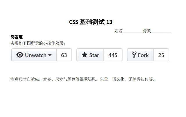
具体实现
我的实现
<!DOCTYPE html>
<html lang="en">

<head>
  <meta charset="UTF-8">
  <meta name="viewport" content="width=device-width, initial-scale=1.0">
  <meta http-equiv="X-UA-Compatible" content="ie=edge">
  <title>Document</title>
  <style>
    html,
    body {
      background-color: white;
      margin: 0;
      height: 100%;
    }

    .button {
      border: 1px solid rgb(204, 208, 211);
      border-radius: 3px;
      display: inline-block;
      font-size: 16px;
    }

    .left {
      background: rgb(241, 244, 247);
      border-right: 1px solid rgb(204, 208, 211);
      display: inline-block;
      padding: 10px 14px;
      font-weight: bold;
    }

    .text {
      padding: 10px 14px;
      font-weight: bold;
      display: inline-block;
      vertical-align: middle;
    }

    .icon {
      display: inline-block;
      width: 24px;
      height: 24px;
      vertical-align: middle;
    }

    .label {
      vertical-align: middle;
    }

    .eye {
      background: url("data:image/svg+xml,%3Csvg viewBox='0 0 16 16' width='16' height='16' xmlns='http://www.w3.org/2000/svg' fill='%2324292e' aria-hidden='true'%3E%3Cpath fill-rule='evenodd' d='M8.06 2C3 2 0 8 0 8s3 6 8.06 6C13 14 16 8 16 8s-3-6-7.94-6zM8 12c-2.2 0-4-1.78-4-4 0-2.2 1.8-4 4-4 2.22 0 4 1.8 4 4 0 2.22-1.78 4-4 4zm2-4c0 1.11-.89 2-2 2-1.11 0-2-.89-2-2 0-1.11.89-2 2-2 1.11 0 2 .89 2 2z'/%3E%3C/svg%3E") no-repeat center/100%;
    }

    .star {
      background: url("data:image/svg+xml,%3Csvg viewBox='0 0 16 16' width='16' height='16' xmlns='http://www.w3.org/2000/svg' fill='%2324292e' aria-hidden='true'%3E%3Cpath fill-rule='evenodd' d='M14 6l-4.9-.64L7 1 4.9 5.36 0 6l3.6 3.26L2.67 14 7 11.67 11.33 14l-.93-4.74L14 6z'/%3E%3C/svg%3E") no-repeat center/100%;
    }

   .fork {
      background: url("data:image/svg+xml,%3Csvg viewBox='0 0 16 16' width='16' height='16' xmlns='http://www.w3.org/2000/svg' fill='%2324292e' aria-hidden='true'%3E%3Cpath fill-rule='evenodd' d='M8 1a1.993 1.993 0 00-1 3.72V6L5 8 3 6V4.72A1.993 1.993 0 002 1a1.993 1.993 0 00-1 3.72V6.5l3 3v1.78A1.993 1.993 0 005 15a1.993 1.993 0 001-3.72V9.5l3-3V4.72A1.993 1.993 0 008 1zM2 4.2C1.34 4.2.8 3.65.8 3c0-.65.55-1.2 1.2-1.2.65 0 1.2.55 1.2 1.2 0 .65-.55 1.2-1.2 1.2zm3 10c-.66 0-1.2-.55-1.2-1.2 0-.65.55-1.2 1.2-1.2.65 0 1.2.55 1.2 1.2 0 .65-.55 1.2-1.2 1.2zm3-10c-.66 0-1.2-.55-1.2-1.2 0-.65.55-1.2 1.2-1.2.65 0 1.2.55 1.2 1.2 0 .65-.55 1.2-1.2 1.2z'%3E%3C/path%3E%3C/svg%3E") no-repeat center/100%;
    }

    .triangle {
      display: inline-block;
      border: 6px solid transparent;
      border-top-color: #000;
      vertical-align: -5px;
    }
  </style>
</head>

<body>
  <span class="button">
    <span class="left">
      <span class="icon eye"></span>
      <span class="label">Unwatch</span>
      <span class="triangle"></span>
    </span>
    <span class="text">
      63
    </span>
  </span>
  <span class="button">
    <span class="left">
      <span class="icon star"></span>
      <span class="label">Star</span>
    </span>
    <span class="text">
      445
    </span>
  </span>
  <span class="button">
    <span class="left">
      <span class="icon fork"></span>
      <span class="label">Fork</span>
    </span>
    <span class="text">
      25
    </span>
  </span>
</body>

</html>
最佳实现一
<!DOCTYPE html>
<html lang="en">

<head>
  <meta charset="UTF-8">
  <meta name="viewport" content="width=device-width, initial-scale=1.0">
  <meta http-equiv="X-UA-Compatible" content="ie=edge">
  <title>Document</title>
  <style>
    html,
    body {
      background-color: white;
      margin: 0;
      height: 100%;
    }

    /* zxx: 视觉还原OK,布局也很稳健,就算低头皇冠也不会掉 */
    body {
      font-family: -apple-system, BlinkMacSystemFont, "Segoe UI", Helvetica, Arial, sans-serif;
    }

    /** 主容器 **/
    .btn-group-container {
      display: flex;
    }

    /** 按钮组 **/
    .btn-group {
      display: flex;
      align-items: center;
    }

    .btn-group + .btn-group {
      margin-left: 10px;
    }

    .btn-group .btn {
      border-radius: 0;
    }

    .btn-group > .btn:not(:first-child),
    .btn-group > .details-menu:not(:first-child) {
      margin-left: -1px;
    }

    .btn-group > .btn:first-child,
    .btn-group > .details-menu:first-child > .btn {
      border-top-left-radius: .25em;
      border-bottom-left-radius: .25em;
    }

    .btn-group > .btn:last-child,
    .btn-group > .details-menu:last-child > .btn {
      border-top-right-radius: .25em;
      border-bottom-right-radius: .25em;
    }

    /** 按钮 **/
    .btn {
      position: relative;
      display: inline-flex;
      align-items: center;
      padding: 3px 9px;
      font-size: 12px;
      font-weight: 600;
      line-height: 20px;
      white-space: nowrap;
      vertical-align: middle;
      cursor: pointer;
      -webkit-user-select: none;
      -moz-user-select: none;
      -ms-user-select: none;
      user-select: none;
      font-family: inherit;
      background-repeat: repeat-x;
      background-position: -1px -1px;
      background-size: 110% 110%;
      border: 1px solid #ccced0;
      border-radius: .25em;
      text-decoration: none;
      -webkit-appearance: none;
      -moz-appearance: none;
      appearance: none;
    }

    .btn:hover {
      z-index: 1;
    }

    .btn > .svg-icon {
      width: 20px;
      height: 20px;
      margin-right: 2px;
      fill: currentColor;
      speak: none;
    }

    /** 按钮主题定义 **/
    .btn-default {
      color: #24292e;
      background-color: #eff3f6;
      background-image: linear-gradient(-180deg, #fafbfc, #eff3f6 90%);
    }

    .btn-default:hover {
      background-color: #e6ebf1;
      background-image: linear-gradient(-180deg, #f0f3f6, #e6ebf1 90%);
      background-position: -.5em;
      border-color: #a5a8ac;
    }

    .btn-link {
      color: #24292e;
      background-color: #fff;
    }

    .btn-link:hover {
      color: #0366d6;
    }

    /** 按钮下拉菜单 **/
    .details-menu {
      position: relative;
      display: block;
    }

    .details-menu-btn::-webkit-details-marker {
      display: none;
    }

    .details-menu-btn::after {
      content: "";
      display: inline-block;
      width: 0;
      height: 0;
      margin-left: 3px;
      transform: translateY(25%);
      border: 4px solid transparent;
      border-top-color: currentColor;
    }

    .details-menu-modal {
      position: absolute;
    }
  </style>
</head>

<body>
  <div class="btn-group-container">
    <div class="btn-group">
      <details class="details-menu">
        <summary class="details-menu-btn btn btn-default" role="button" aria-label="watch">
          <svg class="svg-icon">
            <use xlink:href="#icon-watch"></use>
          </svg>
          Unwatch
        </summary>
        <div class="details-menu-modal">
          菜单(略)
        </div>
      </details>
      <a class="btn btn-link" href="#" aria-label="63 users are watching this repository">
        63
      </a>
    </div>
    <div class="btn-group">
      <button class="btn btn-default" aria-label="star">
        <svg class="svg-icon">
          <use xlink:href="#icon-star"></use>
        </svg>
        Star
      </button>
      <a class="btn btn-link" href="#" aria-label="445 users starred this repository">
        445
      </a>
    </div>
    <div class="btn-group">
      <button class="btn btn-default" aria-label="fork">
        <svg class="svg-icon">
          <use xlink:href="#icon-fork"></use>
        </svg>
        Fork
      </button>
      <a class="btn btn-link" href="#" aria-label="25 users forked this repository">
        25
      </a>
    </div>
  </div>

  <!-- svg sprite -->
  <svg style="display:none">
    <symbol id="icon-star" viewBox="0 0 1024 1024">
      <path
        d="M897.02475785 421.36072708q0 10.18094348-12.0320238 22.21296648l-167.98556122 163.82063007 39.7982321 231.38507126q0.46277048 3.23939099 0.46277049 9.25540249 0 9.71817297-4.8590865 16.42833981t-14.11448899 6.71016683q-8.79263282 0-18.51080579-5.55324181l-207.78379414-109.21375365-207.78379414 109.21375365q-10.18094348 5.55324181-18.51080579 5.55324181-9.71817297 0-14.57725948-6.71016683t-4.8590865-16.42833981q0-2.77662051 0.92554019-9.25540249l39.79823209-231.38507126-168.44833171-163.82063007q-11.56925333-12.49479349-11.56925333-22.21296648 0-17.12249514 25.91512796-21.2874263l232.31061143-33.7822206 104.12328232-210.56041464q8.79263282-18.97357548 22.67573696-18.97357548t22.67573696 18.97357548l104.12328232 210.56041464 232.31061143 33.7822206q25.91512795 4.16493117 25.91512797 21.2874263z">
      </path>
    </symbol>
    <symbol id="icon-fork" viewBox="0 0 1024 1024">
      <path
        d="M689.1875 94.2366333a117.7115625 117.7115625 0 0 0-59.06250001 219.7125V389.54913331L512 507.6741333 393.87500001 389.54913331V313.9491333A117.7115625 117.7115625 0 0 0 334.8125 94.2366333a117.7115625 117.7115625 0 0 0-59.0625 219.7125V419.0803833l177.1875 177.18750001v105.13124999A117.7115625 117.7115625 0 0 0 512 921.11163331a117.7115625 117.7115625 0 0 0 59.0625-219.71250001V596.26788331l177.1875-177.18750001V313.9491333A117.7115625 117.7115625 0 0 0 689.1875 94.2366333zM334.8125 283.23663331C295.83124999 283.23663331 263.9375 250.75225831 263.9375 212.3616333c0-38.39062499 32.484375-70.875 70.875-70.87499999 38.39062499 0 70.875 32.484375 70.875 70.87499999 0 38.39062499-32.484375 70.875-70.875 70.87500001z m177.1875 590.62499999c-38.98125001 0-70.875-32.484375-70.875-70.875 0-38.39062499 32.484375-70.875 70.875-70.875 38.39062499 0 70.875 32.484375 70.875 70.875 0 38.39062499-32.484375 70.875-70.875 70.875z m177.1875-590.62499999c-38.98125001 0-70.875-32.484375-70.875-70.87500001 0-38.39062499 32.484375-70.875 70.875-70.87499999 38.39062499 0 70.875 32.484375 70.875 70.87499999 0 38.39062499-32.484375 70.875-70.875 70.87500001z">
      </path>
    </symbol>
    <symbol id="icon-watch" viewBox="0 0 1024 1024">
      <path
        d="M512 209.408c-201.728 0-374.016 125.44-443.8016 302.592C137.984 689.152 310.272 814.592 512 814.592c201.9328 0 374.016-125.44 443.8016-302.592C886.016 334.848 713.9328 209.408 512 209.408z m0 504.32A201.8304 201.8304 0 0 1 310.272 512 201.7792 201.7792 0 0 1 512 310.272 201.7792 201.7792 0 0 1 713.728 512 201.8304 201.8304 0 0 1 512 713.728z m0-322.7648A121.1392 121.1392 0 0 0 390.9632 512 121.1392 121.1392 0 0 0 512 633.0368 121.1392 121.1392 0 0 0 633.0368 512 121.1392 121.1392 0 0 0 512 390.9632z">
      </path>
    </symbol>
  </svg>
</body>

</html>
最佳实现二
<!DOCTYPE html>
<html lang="en">

<head>
  <meta charset="UTF-8">
  <meta name="viewport" content="width=device-width, initial-scale=1.0">
  <meta http-equiv="X-UA-Compatible" content="ie=edge">
  <title>Document</title>
  <style>
    html,
    body {
      background-color: white;
      margin: 0;
      height: 100%;
    }

    .icon-container {
      padding: 0;
      font-size: 0;
    }

    .icon-group {
      display: inline-block;
      margin-left: 10px;
      list-style-type: none;
    }

    .icon-group a {
      display: inline-block;
      line-height: 26px;
      font-size: 12px;
      font-weight: bold;
      text-decoration: none;
      color: #24292e;
    }

    .icon-description {
      padding: 0 10px 0 30px;
      border: 1px solid rgba(27, 31, 35, .2);
      border-radius: 3px 0 0 3px;
      background-image: linear-gradient(to bottom,#fafbfc,#eff3f6);
    }

    .icon-description:hover {
      border-color: rgba(27, 31, 35, .35);
      background-image: linear-gradient(to bottom,#f0f3f6,#e6ebf1 90%);
    }

    .icon-number {
      padding: 0 10px;
      border: 1px solid rgba(27, 31, 35, .2);
      border-left: 0;
      border-radius: 0 3px 3px 0px;
    }

    .icon-number:hover {
      color: #0366d6;
    }

    .icon-description::before {
      content: '';
      position: absolute;
      width: 16px;
      height: 16px;
      margin: 5px 0 0 -20px;
    }

    .icon-description[icon-watch]::before {
      background-image: url("data:image/svg+xml,%3Csvg viewBox='0 0 16 16' width='16' height='16' xmlns='http://www.w3.org/2000/svg' fill='%2324292e' aria-hidden='true'%3E%3Cpath fill-rule='evenodd' d='M8.06 2C3 2 0 8 0 8s3 6 8.06 6C13 14 16 8 16 8s-3-6-7.94-6zM8 12c-2.2 0-4-1.78-4-4 0-2.2 1.8-4 4-4 2.22 0 4 1.8 4 4 0 2.22-1.78 4-4 4zm2-4c0 1.11-.89 2-2 2-1.11 0-2-.89-2-2 0-1.11.89-2 2-2 1.11 0 2 .89 2 2z'/%3E%3C/svg%3E");
    }

    .icon-description[icon-star]::before {
      background-image: url("data:image/svg+xml,%3Csvg viewBox='0 0 16 16' width='16' height='16' xmlns='http://www.w3.org/2000/svg' fill='%2324292e' aria-hidden='true'%3E%3Cpath fill-rule='evenodd' d='M14 6l-4.9-.64L7 1 4.9 5.36 0 6l3.6 3.26L2.67 14 7 11.67 11.33 14l-.93-4.74L14 6z'/%3E%3C/svg%3E");
    }

    .icon-description[icon-fork]::before {
      background-image: url("data:image/svg+xml,%3Csvg viewBox='0 0 16 16' width='16' height='16' xmlns='http://www.w3.org/2000/svg' fill='%2324292e' aria-hidden='true'%3E%3Cpath fill-rule='evenodd' d='M8 1a1.993 1.993 0 00-1 3.72V6L5 8 3 6V4.72A1.993 1.993 0 002 1a1.993 1.993 0 00-1 3.72V6.5l3 3v1.78A1.993 1.993 0 005 15a1.993 1.993 0 001-3.72V9.5l3-3V4.72A1.993 1.993 0 008 1zM2 4.2C1.34 4.2.8 3.65.8 3c0-.65.55-1.2 1.2-1.2.65 0 1.2.55 1.2 1.2 0 .65-.55 1.2-1.2 1.2zm3 10c-.66 0-1.2-.55-1.2-1.2 0-.65.55-1.2 1.2-1.2.65 0 1.2.55 1.2 1.2 0 .65-.55 1.2-1.2 1.2zm3-10c-.66 0-1.2-.55-1.2-1.2 0-.65.55-1.2 1.2-1.2.65 0 1.2.55 1.2 1.2 0 .65-.55 1.2-1.2 1.2z'%3E%3C/path%3E%3C/svg%3E")
    }
  </style>
</head>

<body>
  <ul class="icon-container">
    <li class="icon-group">
      <a class="icon-description" href="javascript:void;" role="button" icon-watch>
        Unwatch
      </a>
      <a class="icon-number" href="javascript:void;" role="button" aria-label="63 users are watching this repository">63</a>
    </li>
    <li class="icon-group">
      <a class="icon-description" href="javascript:void;" role="button" icon-star>
        Star
      </a>
      <a class="icon-number" href="javascript:void;" role="button" aria-label="445 users starred this repository">445</a>
    </li>
    <li class="icon-group">
      <a class="icon-description" href="javascript:void;" role="button" icon-fork>
        Fork
      </a>
      <a class="icon-number" href="javascript:void;" role="button" aria-label="25 users forked this repository">25</a>
    </li>
  </ul>
</body>

</html>
实现要点
- 按钮我们没有任何理由使用
<a>标签,除非你要兼容 IE7,所以标签使用应该是 button + a。 - 可以考虑多按钮,多链接时候的样式表现,会更健壮,扩展性更强。
- 每个按钮组是不能换行的,按钮组可以使用 flex 布局,如果考虑兼容,可以里面内联 + white-space: nowrap;
- 按钮组的实现方法,大家实现有 3 种(inline-block,float,inline-flex),如果考虑要点 3,float 布局是不推荐的,因为当下是无法阻止 float 内容不换行的。table 布局其实是上上之选,天然一行显示,兼容到 IE8。
- 每个按钮控制不要使用标签选择器,而是树结构伪类,例如 :first-child,:last-child,例如圆角::first-child{border-radius: 3px 0 0 3px;}:last-child{border-radius: 0 3px 3px 0;}。此时就非常强,不要使用标签以及类名进行判断。
- 同样的,中间的线要走合并,每一个元素都要有完整的边框(如 margin 负值合并),而不是根据标签类型进行缺省。
CSS 测试十四
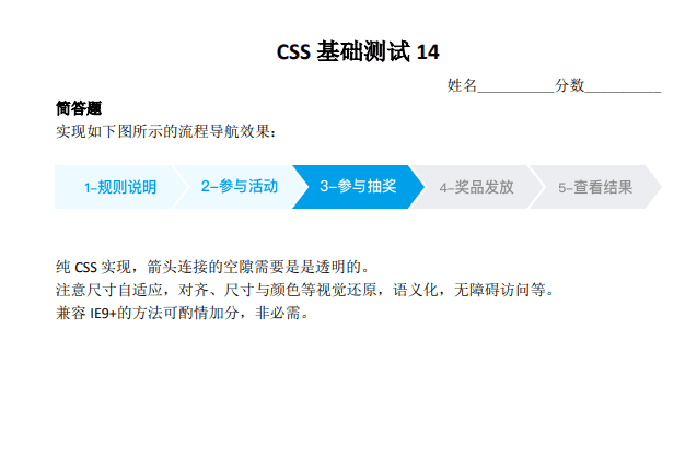
具体实现
我的实现
<!DOCTYPE html>
<html lang="en">

<head>
  <meta charset="UTF-8">
  <meta name="viewport" content="width=device-width, initial-scale=1.0">
  <meta http-equiv="X-UA-Compatible" content="ie=edge">
  <title>Document</title>
  <style>
    html,
    body {
      background-color: white;
      margin: 0;
      height: 100%;
    }

    .nav {
      font-size: 16px;
      line-height: 1;
    }

    .menu {
      list-style: none;
      counter-reset: count;
    }

    .item {
      display: inline-block;
      padding: 1em;
      position: relative;
      color: rgb(64, 183, 239);
      border-color: rgb(237, 249, 255);
      background: rgb(237, 249, 255);
      cursor: pointer;
    }

    .item + .item {
      margin-left: 1.5em;
    }

    .item:first-child {
      padding-left: 2em;
    }

    .item a::before {
      content: counter(count) "-";
      counter-increment: count;
    }

    a {
      text-decoration: none;
    }

    a:visited {
      color: currentColor;
    }

    .active {
      background: rgb(0, 159, 233);
      color: #fff;
      border-color: rgb(0, 159, 233);
    }

    .active ~ .item {
      background: rgb(235, 237, 240);
      color: rgb(183, 184, 185);
      border-color: rgb(235, 237, 240);
    }

    .item:not(:first-child)::before {
      content: '';
      position: absolute;
      right: 100%;
      bottom: 0;
      border: 1.5em solid;
      border-color: inherit;
      border-right: none;
      border-left: 1em solid transparent;
    }

    .item:after {
      content: '';
      position: absolute;
      left: 100%;
      bottom: 0;
      border: 1.5em solid transparent;
      border-left: 1em solid;
      border-left-color: inherit;
    }
  </style>
</head>

<body>
  <nav class="nav">
    <ol class="menu">
      <li class="item">
        <a href="">
          规则说明
        </a>
      </li>
      <li class="item">
        <a href="">
          参与活动
        </a>
      </li>
      <li class="item active">
        <a href="">
          参与抽奖
        </a>
      </li>
      <li class="item">
        <a href="">
          奖品发放
        </a>
      </li>
      <li class="item">
        <a href="">
          查看结果
        </a>
      </li>
    </ol>
  </nav>
</body>

</html>
最佳实现一
<!DOCTYPE html>
<html lang="en">

<head>
  <meta charset="UTF-8">
  <meta name="viewport" content="width=device-width, initial-scale=1.0">
  <meta http-equiv="X-UA-Compatible" content="ie=edge">
  <title>Document</title>
  <style>
    html,
    body {
      background-color: white;
      margin: 0;
      height: 100%;
    }

    /* zxx: 计数器的使用加分 */
    .navigation {
      display: flex;
      list-style: none;
      counter-reset: listCounter;
      font-size: 16px;
      line-height: 1;
    }

    a {
      text-decoration: none;
    }

    a:visited {
      color: currentColor;
    }

    .navigation-item a::before {
      content: counter(listCounter) "-";
    }

    .navigation-item {
      position: relative;
      counter-increment: listCounter;
      color: #499fe9;
      border-color: #edf9fe;
      background: #edf9fe;
      padding: 1em;
      white-space: nowrap;
      cursor: pointer;
    }

    .navigation-item:first-child {
      padding-left: 2.3em;
    }

    .navigation-item:not(:first-child)::before {
      border: 1.5em solid;
      border-color: inherit;
      border-left: 1.3em solid transparent;
      border-right: none;
      position: absolute;
      /* 父容器的左边界之外 */
      right: 100%;
      top: 0;
      content: '';
    }

    .navigation-item::after {
      border: 1.5em solid transparent;
      border-left: 1.3em solid;
      border-left-color: inherit;
      position: absolute;
      /* 父容器的右边界之外 */
      left: 100%;
      top: 0;
      content: '';
    }

    .navigation-item + .navigation-item {
      margin-left: 1.5em;
    }

    [aria-current] {
      background: #499fe9;
      border-color: #499fe9;
      color: #edf9fe;
    }

    [aria-current] ~ .navigation-item {
      background: #eee;
      border-color: #eee;
      color: #999;
    }
  </style>
</head>

<body>
  <nav role="navigation">
    <ol class="navigation">
      <li class="navigation-item"><a href="">规则说明</a></li>
      <li class="navigation-item"><a href="">参与活动</a></li>
      <li class="navigation-item" aria-current="true"><a href="">参与抽奖</a></li>
      <li class="navigation-item"><a href="">奖品发放</a></li>
      <li class="navigation-item"><a href="">查看结果</a></li>
    </ol>
  </nav>
</body>

</html>
实现要点
- 就本题实际开发而言,反序是没有必要的。因为会常驻选中类名,DOM 顺序是 1-5 也是可以实现样式控制的。所有列表淡蓝, .active 高亮深天空蓝,~ 后面的灰色。给前面的状态添加一个独立的类名是会增加实际开发的复杂度,是不推荐的,应该活用选择器的一些技术降低我们的维护成本。
- 应该是 1/2 尺寸图,考虑下不要掉下来。
- 三角的实现,三类方法:
- clip-path:最容易理解,比较符合现实认知,推荐百分比控制(无论尺寸大小形状都 OK),最大的问题:兼容性,IE 全军覆没,移动端可以使用。
- border: 切图前端必备技能。https://www.zhangxinxu.com/wordpress/?p=794 问题:定位比较啰嗦(占据尺寸,需要具体定位),border 不支持百分比(据说新的规范在考虑支持),尺寸变化有额外成本。优点:兼容性非常好,IE7+ 支持。border-color: transparent; IE7+支持,IE6 需要使用 dashed 实现。background: transparent; IE6+ 支持。 color: transparent; IE9+ 支持,原生 IE8 不支持。
- transform: skewX()。最佳实现,兼顾尺寸控制,定位与兼容性,理解也非常好理解。兼容性 IE9+ 都支持,-ms-。现在 2019 年了,对于 transform 属性,-webkit-, -moz- 私有前缀没有必要再写了。
- 前面的数值显示。使用计数器,前面的 1-, 2-, 3-, … 没有必要写在 HTML 中,以后调整(增减),HTML 还需要同时维护。counter 计数器优化我们的实现。https://www.zhangxinxu.com/wordpress/?p=4303 IE8+支持。
- 语义,更接近 ol > li。还有一点 nav 的语义。
CSS 测试十五
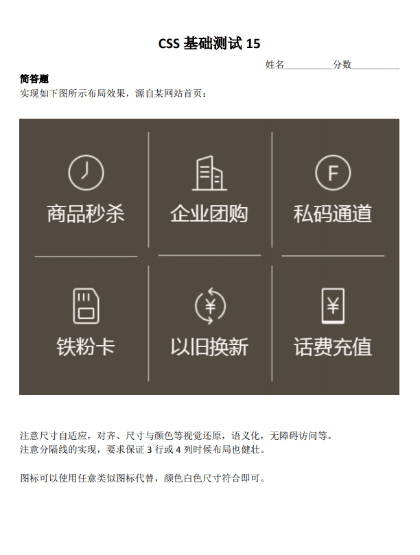
具体实现
最佳实现一
<!DOCTYPE html>
<html lang="en">
<head>
  <meta charset="UTF-8">
  <meta name="viewport" content="width=device-width, initial-scale=1.0">
  <meta http-equiv="X-UA-Compatible" content="ie=edge">
  <title>Document</title>
  <style>
    html,
    body {
      background-color: white;
      margin: 0;
      height: 100%;
    }

    .list {
      display: grid;
      grid-template-columns: repeat(auto-fill, minmax(150px, 1fr));
      color: #524940;
      border: 15px solid;
      background-color: currentColor;
      grid-gap: 1px;
      overflow: hidden;
    }

    .list-item {
      position: relative;
      text-align: center;
      color: #e9e3e1;
      padding: 30px 15px;
      text-decoration: none;
      /* 外边距向外覆盖1px,注意和.list下的overflow: hidden;的配合,屏蔽掉最外层的边框 */
      margin: -1px;
      /* overflow: hidden; 与 border-radius: 15px; 的配合形成内圆间距 */
      overflow: hidden;
      border-radius: 15px;
      transition: .2s;
      outline: 0;
    }

    .list-item:hover,
    .list-item:focus {
      z-index: 1;
      color: #ffdd40;
    }

    .list-item::before {
      /* 生成 1px 外边框 */
      content: '';
      position: absolute;
      left: 1px;
      top: 1px;
      right: 1px;
      bottom: 1px;
      pointer-events: none;
      box-shadow: 0 0 0 1px currentColor;
    }

    .list-item-icon {
      font-size: 30px;
    }

    .list-item-title {
      font-size: 16px;
      display: block;
      margin-top: 15px;
    }

    css-icon {
      display: inline-block;
      height: 1em;
      width: 1em;
      font-size: 20px;
      box-sizing: border-box;
      text-indent: -9999px;
      vertical-align: middle;
      position: relative;
    }

    css-icon::before,
    css-icon::after {
      content: '';
      box-sizing: inherit;
      position: absolute;
      left: 50%;
      top: 50%;
      -ms-transform: translate(-50%, -50%);
      transform: translate(-50%, -50%);
    }

    .icon-mail::before {
      width: .9em;
      height: .75em;
      border: 2px solid;
      border-radius: 2px;
    }

    .icon-mail::after {
      width: .4em;
      height: .4em;
      border-style: solid;
      border-width: 0 0 2px 2px;
      -ms-transform: translate(-50%, -.35em) rotate(-45deg) skew(10deg, 10deg);
      transform: translate(-50%, -.35em) rotate(-45deg) skew(10deg, 10deg);
    }
  </style>
</head>
<body>
  <nav class="list">
    <a class="list-item" href="#">
      <css-icon class="list-item-icon icon-mail"></css-icon>
      <span class="list-item-title">商品秒杀</span>
    </a>
    <a class="list-item" href="#">
      <css-icon class="list-item-icon icon-mail"></css-icon>
      <span class="list-item-title">商品秒杀</span>
    </a>
    <a class="list-item" href="#">
      <css-icon class="list-item-icon icon-mail"></css-icon>
      <span class="list-item-title">商品秒杀</span>
    </a>
    <a class="list-item" href="#">
      <css-icon class="list-item-icon icon-mail"></css-icon>
      <span class="list-item-title">商品秒杀</span>
    </a>
    <a class="list-item" href="#">
      <css-icon class="list-item-icon icon-mail"></css-icon>
      <span class="list-item-title">商品秒杀</span>
    </a>
    <a class="list-item" href="#">
      <css-icon class="list-item-icon icon-mail"></css-icon>
      <span class="list-item-title">商品秒杀</span>
    </a>
      <a class="list-item" href="#">
      <css-icon class="list-item-icon icon-mail"></css-icon>
      <span class="list-item-title">商品秒杀</span>
    </a>
      <a class="list-item" href="#">
      <css-icon class="list-item-icon icon-mail"></css-icon>
      <span class="list-item-title">商品秒杀</span>
    </a>
        <a class="list-item" href="#">
      <css-icon class="list-item-icon icon-mail"></css-icon>
      <span class="list-item-title">商品秒杀</span>
    </a>
      <a class="list-item" href="#">
      <css-icon class="list-item-icon icon-mail"></css-icon>
      <span class="list-item-title">商品秒杀</span>
    </a>
  </nav>
</body>
</html>
最佳实现二
<!DOCTYPE html>
<html lang="en">
<head>
  <meta charset="UTF-8">
  <meta name="viewport" content="width=device-width, initial-scale=1.0">
  <meta http-equiv="X-UA-Compatible" content="ie=edge">
  <title>Document</title>
  <style>
    html,
    body {
      background-color: white;
      margin: 0;
    }

    nav {
      overflow: hidden;
    }

    a {
      text-decoration: none;
      color: currentColor;
    }

    .server_list {
      display: flex;
      flex-wrap: wrap;
      justify-content: space-between;
      /* 遮住顶部、左边的线 */
      margin: -2px 0 0 -2px;
      padding: 0;
      list-style: none;
      font-size: 24px;
      background-color: #524840;
    }

    .server_item {
      position: relative;
      flex: 1 1 33%;
      min-width: 140px;
      text-align: center;
      padding: 40px 0;
      color: #ece5e4;
    }

    .server_item::before,
    .server_item::after {
      content: '';
      position: absolute;
      background-color: #8f8a85;
    }

    .server_item::before {
      top: 0;
      right: 12px;
      left: 12px;
      height: 2px;
    }

    .server_item::after {
      top: 12px;
      bottom: 12px;
      left: 0;
      width: 2px;
    }

    .server_icon {
      display: block;
      width: 50px;
      height: 50px;
      background-size: 50px 50px;
      margin: 0 auto 15px;
    }

    .server_icon_clock {
      background-image: url("data:image/svg+xml,%3Csvg xmlns='http://www.w3.org/2000/svg' viewBox='0 0 512 512'%3E %3Cpath fill='%23ece5e4' d='M256 8C119 8 8 119 8 256s111 248 248 248 248-111 248-248S393 8 256 8zm0 448c-110.5 0-200-89.5-200-200S145.5 56 256 56s200 89.5 200 200-89.5 200-200 200zm61.8-104.4l-84.9-61.7c-3.1-2.3-4.9-5.9-4.9-9.7V116c0-6.6 5.4-12 12-12h32c6.6 0 12 5.4 12 12v141.7l66.8 48.6c5.4 3.9 6.5 11.4 2.6 16.8L334.6 349c-3.9 5.3-11.4 6.5-16.8 2.6z'%3E%3C/path%3E %3C/svg%3E");
    }

    .server_icon_enterprise {
      background-image: url("data:image/svg+xml,%3Csvg xmlns='http://www.w3.org/2000/svg' viewBox='0 0 640 512'%3E %3Cpath fill='%23ece5e4' d='M504 352H136.4c-4.4 0-8 3.6-8 8l-.1 48c0 4.4 3.6 8 8 8H504c4.4 0 8-3.6 8-8v-48c0-4.4-3.6-8-8-8zm0 96H136.1c-4.4 0-8 3.6-8 8l-.1 48c0 4.4 3.6 8 8 8h368c4.4 0 8-3.6 8-8v-48c0-4.4-3.6-8-8-8zm0-192H136.6c-4.4 0-8 3.6-8 8l-.1 48c0 4.4 3.6 8 8 8H504c4.4 0 8-3.6 8-8v-48c0-4.4-3.6-8-8-8zm106.5-139L338.4 3.7a48.15 48.15 0 0 0-36.9 0L29.5 117C11.7 124.5 0 141.9 0 161.3V504c0 4.4 3.6 8 8 8h80c4.4 0 8-3.6 8-8V256c0-17.6 14.6-32 32.6-32h382.8c18 0 32.6 14.4 32.6 32v248c0 4.4 3.6 8 8 8h80c4.4 0 8-3.6 8-8V161.3c0-19.4-11.7-36.8-29.5-44.3z'%3E%3C/path%3E %3C/svg%3E");
    }

    .server_icon_aisle {
      background-image: url("data:image/svg+xml,%3Csvg xmlns='http://www.w3.org/2000/svg' viewBox='0 0 496 512'%3E %3Cpath fill='%23ece5e4' d='M248 8.8c-137 0-248 111-248 248s111 248 248 248 248-111 248-248-111-248-248-248zm0 482.8c-129.7 0-234.8-105.1-234.8-234.8S118.3 22 248 22s234.8 105.1 234.8 234.8S377.7 491.6 248 491.6zm155.1-328.5v-46.8H209.3V198H54.2l36.7 46h117.7v196.8h48.8V245h83.3v-47h-83.3v-34.8h145.7zm-73.3 45.1v23.9h-82.9v197.4h-26.8V232.1H96.3l-20.1-23.9h143.9v-80.6h171.8V152h-145v56.2zm-161.3-69l-12.4-20.7 2.1 23.8-23.5 5.4 23.3 5.4-2.1 24 12.3-20.5 22.2 9.5-15.7-18.1 15.8-18.1zm-29.6-19.7l9.3-11.5-12.7 5.9-8-12.4 1.7 13.9-14.3 3.8 13.7 2.7-.8 14.7 6.8-12.2 13.8 5.3zm165.4 145.2l-13.1 5.6-7.3-12.2 1.3 14.2-13.9 3.2 13.9 3.2-1.2 14.2 7.3-12.2 13.1 5.5-9.4-10.7zm106.9-77.2l-20.9 9.1-12-19.6 2.2 22.7-22.3 5.4 22.2 4.9-1.8 22.9 11.5-19.6 21.2 8.8-15.1-17zM248 29.9c-125.3 0-226.9 101.6-226.9 226.9S122.7 483.7 248 483.7s226.9-101.6 226.9-226.9S373.3 29.9 248 29.9zM342.6 196v51h-83.3v195.7h-52.7V245.9H89.9l-40-49.9h157.4v-81.6h197.8v50.7H259.4V196zM248 43.2c60.3 0 114.8 25 153.6 65.2H202.5V190H45.1C73.1 104.8 153.4 43.2 248 43.2zm0 427.1c-117.9 0-213.6-95.6-213.6-213.5 0-21.2 3.1-41.8 8.9-61.1L87.1 252h114.7v196.8h64.6V253h83.3v-62.7h-83.2v-19.2h145.6v-50.8c30.8 37 49.3 84.6 49.3 136.5.1 117.9-95.5 213.5-213.4 213.5zM178.8 275l-11-21.4 1.7 24.5-23.7 3.9 23.8 5.9-3.7 23.8 13-20.9 21.5 10.8-15.8-18.8 16.9-17.1z'%3E%3C/path%3E %3C/svg%3E");
    }

    .server_icon_fans {
      background-image: url("data:image/svg+xml,%3Csvg xmlns='http://www.w3.org/2000/svg' viewBox='0 0 384 512'%3E %3Cpath fill='%23ece5e4' d='M320 0H128L0 128v320c0 35.3 28.7 64 64 64h256c35.3 0 64-28.7 64-64V64c0-35.3-28.7-64-64-64zM160 160h-48V64h48v96zm80 0h-48V64h48v96zm80 0h-48V64h48v96z'%3E%3C/path%3E %3C/svg%3E");
    }

    .server_icon_change {
      background-image: url("data:image/svg+xml,%3Csvg xmlns='http://www.w3.org/2000/svg' viewBox='0 0 640 512'%3E %3Cpath fill='%23ece5e4' d='M629.657 343.598L528.971 444.284c-9.373 9.372-24.568 9.372-33.941 0L394.343 343.598c-9.373-9.373-9.373-24.569 0-33.941l10.823-10.823c9.562-9.562 25.133-9.34 34.419.492L480 342.118V160H292.451a24.005 24.005 0 0 1-16.971-7.029l-16-16C244.361 121.851 255.069 96 276.451 96H520c13.255 0 24 10.745 24 24v222.118l40.416-42.792c9.285-9.831 24.856-10.054 34.419-.492l10.823 10.823c9.372 9.372 9.372 24.569-.001 33.941zm-265.138 15.431A23.999 23.999 0 0 0 347.548 352H160V169.881l40.416 42.792c9.286 9.831 24.856 10.054 34.419.491l10.822-10.822c9.373-9.373 9.373-24.569 0-33.941L144.971 67.716c-9.373-9.373-24.569-9.373-33.941 0L10.343 168.402c-9.373 9.373-9.373 24.569 0 33.941l10.822 10.822c9.562 9.562 25.133 9.34 34.419-.491L96 169.881V392c0 13.255 10.745 24 24 24h243.549c21.382 0 32.09-25.851 16.971-40.971l-16.001-16z'%3E%3C/path%3E %3C/svg%3E");
    }

    .server_icon_charge {
      background-image: url("data:image/svg+xml,%3Csvg xmlns='http://www.w3.org/2000/svg' viewBox='0 0 384 512'%3E %3Cpath fill='%23ece5e4' d='M351.2 32h-65.3c-4.6 0-8.8 2.6-10.8 6.7l-55.4 113.2c-14.5 34.7-27.1 71.9-27.1 71.9h-1.3s-12.6-37.2-27.1-71.9L108.8 38.7c-2-4.1-6.2-6.7-10.8-6.7H32.8c-9.1 0-14.8 9.7-10.6 17.6L102.3 200H44c-6.6 0-12 5.4-12 12v32c0 6.6 5.4 12 12 12h88.2l19.8 37.2V320H44c-6.6 0-12 5.4-12 12v32c0 6.6 5.4 12 12 12h108v92c0 6.6 5.4 12 12 12h56c6.6 0 12-5.4 12-12v-92h108c6.6 0 12-5.4 12-12v-32c0-6.6-5.4-12-12-12H232v-26.8l19.8-37.2H340c6.6 0 12-5.4 12-12v-32c0-6.6-5.4-12-12-12h-58.3l80.1-150.4c4.3-7.9-1.5-17.6-10.6-17.6z'%3E%3C/path%3E %3C/svg%3E");
    }

    @media (min-width: 560px) {
      .server_item {
        flex-basis: 25%;
      }
    }
  </style>
</head>
<body>
  <nav>
    <ul class="server_list">
      <li class="server_item">
        <a href="#" aria-label="商品秒杀">
          <i class="server_icon server_icon_clock"></i>商品秒杀
        </a>
      </li>
      <li class="server_item">
        <a href="#" aria-label="企业团购">
          <i class="server_icon server_icon_enterprise"></i>企业团购
        </a>
      </li>
      <li class="server_item">
        <a href="#" aria-label="私码通道">
          <i class="server_icon server_icon_aisle"></i>私码通道
        </a>
      </li>
      <li class="server_item">
        <a href="#" aria-label="铁粉卡">
          <i class="server_icon server_icon_fans"></i>铁粉卡
        </a>
      </li>
      <li class="server_item">
        <a href="#" aria-label="以旧换新">
          <i class="server_icon server_icon_change"></i>以旧换新
        </a>
      </li>
      <li class="server_item">
        <a href="#" aria-label="话费充值">
          <i class="server_icon server_icon_charge"></i>话费充值
        </a>
      </li>

    </ul>
  </nav>
</body>
</html>
最佳实现三
<!DOCTYPE html>
<html lang="en">
<head>
  <meta charset="UTF-8">
  <meta name="viewport" content="width=device-width, initial-scale=1.0">
  <meta http-equiv="X-UA-Compatible" content="ie=edge">
  <title>Document</title>
  <style>
    html,
    body {
      background-color: white;
      margin: 0;
    }

    .nav {
      padding: 0.5em;
      background-color: #524840;
    }

    .nav ul {
      overflow: hidden;
      /* 幽灵空白结点 */
      font-size: 0;
      padding: 0;
      list-style: none;
    }

    .nav li {
      font-size: 16px;
      display: inline-block;
      width: 33.3333%;
      position: relative;
      text-decoration: none;
      text-align: center;
    }

    .nav li:before {
      content: '';
      display: block;
      /* 等于宽度,相当于正方形 */
      padding-top: 100%;
    }

    .nav a {
      color: #f0eae6;
      position: relative;
      border-radius: 20px;
      transition: 200ms;
      text-decoration: none;
      position: absolute;
      top: 0;
      left: 0;
      width: 100%;
      height: 100%;
    }

    .nav a::before,
    .nav a:after {
      content: '';
      position: absolute;
    }

    .nav a::before {
      top: 1em;
      bottom: 1em;
      right: -1px;
      border-right: 1px solid;
    }

    .nav a::after {
      bottom: -1px;
      left: 1em;
      right: 1em;
      border-bottom: 1px solid;
    }

    .nav a:hover,
    .nav a:focus {
      background-color: rgba(56, 46, 46, 0.5);
      outline: none;
      box-shadow: inset 0 0 2px red;
    }

    .nav svg {
      width: 1.5em;
      height: 1.5em;
      fill: currentColor;
      position: absolute;
      bottom: 50%;
      left: 0;
      right: 0;
      margin: 0 auto 4px;
    }

    .nav strong {
      position: absolute;
      margin: 4px auto 0;
      left: 5%;
      right: 5%;
      top: 50%;
      font-weight: 400;
      text-overflow: ellipsis;
      white-space: nowrap;
      overflow: hidden;
    }

    @media screen and (min-width: 600px) {
      .nav li {
        width: 25%;
      }
    }

    @media screen and (min-width: 700px) {
      .nav li {
        width: 20%;
      }
    }

    @media screen and (min-width: 800px) {
      .nav li {
        width: 16.66666%;
      }

      .nav li:before {
        padding-top: 128px;
      }
    }
  </style>
</head>
<body>
  <svg aria-hidden="true" style="position: absolute; width: 0px; height: 0px; overflow: hidden;">
    <symbol id="icon-10" viewBox="0 0 1048 1024">
        <path
            d="M522.789 62C274.27 62 72.8 263.47 72.8 511.979c0 103.301 34.814 198.47 93.343 274.422l33.819-35.21c-49.603-66.83-78.951-149.591-78.951-239.212 0-221.889 179.884-401.767 401.776-401.767 221.884 0 401.767 179.877 401.767 401.767 0 221.896-179.884 401.773-401.767 401.773-80.087 0-154.698-23.436-217.357-63.818l-30.437 37.712c71.064 46.97 156.235 74.318 247.793 74.318 248.516 0 449.986-201.466 449.986-449.986-0.001-248.509-201.471-449.979-449.986-449.979zM329.936 560.201v48.213h176.776v160.708h48.213v-32.144h-0.001l0.001-0.007V608.414h176.779v-48.213H554.925V463.78h176.779v-48.222H589.66L693.167 312.05l-34.726-34.729-127.625 127.611-127.612-127.611-34.733 34.729 103.507 103.508H329.937v48.222h176.776v96.421z"
            fill=""></path>
    </symbol>
    <symbol id="icon-9" viewBox="0 0 1024 1024">
        <path
            d="M511.99999648 335.91327734l97.82565733 0c21.61225898 0 39.1300831-17.51872237 39.1300831-39.1300831 0-21.61225898-17.51872237-39.1300831-39.1300831-39.1300831L492.43450625 257.65311026c-64.83318662 0-117.39114844 52.55796182-117.39114844 117.39114843l0 352.17344443c0 21.61225898 17.51872237 39.1300831 39.13008311 39.13008311 21.61225898 0 39.1300831-17.51872237 39.1300831-39.13008311L453.3035249 629.39114844c0-32.41793935 26.27763398-58.69557422 58.69557422-58.69557422l97.82565732 0c21.61225898 0 39.1300831-17.51872237 39.13008311-39.1300831 0-21.61225898-17.51872237-39.1300831-39.1300831-39.13008311L511.99999648 492.43540713c-32.41793935 0-58.69557422-26.27853222-58.69557421-58.69557422l0-39.13008311C453.30442227 362.19091221 479.58205713 335.91327734 511.99999648 335.91327734z">
        </path>
        <path
            d="M511.99999648 62c-248.52706523 0-450 201.4720374-450 450s201.47293477 450 450 450 450-201.4720374 450-450S760.52706172 62 511.99999648 62zM511.99999648 883.73893555c-205.3061376 0-371.73893555-166.43279795-371.73893554-371.73893555S306.69385888 140.26106445 511.99999648 140.26106445s371.73893555 166.43369531 371.73893555 371.73893555S717.30523584 883.73893555 511.99999648 883.73893555z">
        </path>
    </symbol>
    <symbol id="icon-8" viewBox="0 0 1024 1024">
        <path
            d="M896 512a384 384 0 1 0-384 384 384 384 0 0 0 384-384z m64 0A448 448 0 1 1 512 64a448 448 0 0 1 448 448z">
        </path>
        <path
            d="M544 498.88l118.72 118.4a32 32 0 0 1-45.44 45.44l-128-128A32 32 0 0 1 480 512V224a32 32 0 0 1 64 0z">
        </path>
    </symbol>
    <symbol id="icon-7" viewBox="0 0 1024 1024">
        <path
            d="M520.64711111 949.53244445c-123.67644445 0-246.44266667-51.54133333-332.23111111-150.75555556l32.42666667-27.98933333C355.44177778 926.208 590.50666667 952.03555556 755.93955555 829.49688889 921.37244445 706.84444445 965.17688889 474.39644445 855.60888889 300.43022222l36.29511111-22.86933333c121.40088889 192.85333333 72.81777778 450.44622222-110.47822222 586.29688889-77.824 57.57155555-169.52888889 85.67466667-260.77866667 85.67466667z">
        </path>
        <path
            d="M136.64711111 725.04888889c-107.40622222-191.94311111-54.95466667-435.65511111 122.08355556-566.72711111 177.03822222-131.18577778 425.41511111-110.36444445 577.76355555 48.35555556l-30.94755555 29.58222222C668.10311111 93.01333334 443.96088889 74.24 284.21688889 192.68266667c-159.744 118.32888889-207.18933333 338.26133333-110.25066667 511.43111111L136.64711111 725.04888889z">
        </path>
        <path
            d="M788.25244445 535.95022222c-10.58133333 139.94666667-129.024 249.51466667-269.42577778 249.51466667-140.51555555 0-258.84444445-109.568-269.53955556-249.40088889l-29.12711111 2.16177778c11.83288889 155.07911111 143.01866667 276.48 298.66666667 276.48s286.83377778-121.40088889 298.66666666-276.48l-29.24088888-2.27555556zM250.76622222 480.54044445C267.94666667 346.16888889 383.20355555 244.90666667 518.82666667 244.90666667c135.62311111 0 250.88 101.26222222 268.06044444 235.63377778l29.01333334-3.75466667c-7.96444445-62.57777778-35.38488889-118.55644445-75.43466667-162.58844444l-20.59377778-20.70755556c-53.47555555-48.46933333-124.24533333-77.824-200.93155555-77.824-76.8 0-147.456 29.35466667-201.04533334 77.824l-20.59377778 20.70755556c-40.04977778 44.032-67.47022222 100.01066667-75.43466666 162.58844444l28.89955555 3.75466667z">
        </path>
        <path
            d="M518.82666667 274.14755556c-132.89244445 0-241.09511111 108.08888889-241.09511112 241.09511111s108.08888889 241.09511111 241.09511112 241.09511111 241.09511111-108.08888889 241.09511111-241.09511111S651.71911111 274.14755556 518.82666667 274.14755556z m0 29.24088889c82.60266667 0 154.16888889 47.67288889 189.09866666 116.84977777H329.728c34.816-69.17688889 106.38222222-116.84977778 189.09866667-116.84977777z m0 423.59466667c-116.84977778 0-211.85422222-95.00444445-211.85422222-211.85422223 0-22.98311111 3.75466667-45.056 10.58133333-65.76355555h402.54577777c6.82666667 20.70755555 10.58133333 42.78044445 10.58133334 65.76355555 0 116.84977778-95.11822222 211.85422222-211.85422222 211.85422223z">
        </path>
        <path
            d="M628.39466667 390.99733334m-14.56355556 0a14.56355555 14.56355555 0 1 0 29.12711111 0 14.56355555 14.56355555 0 1 0-29.12711111 0Z">
        </path>
        <path d="M827.27822222 374.272L854.47111111 256.05688889l118.32888889 27.19288889"></path>
        <path d="M208.09955555 629.248L180.90666667 747.46311112l-118.32888889-27.1928889"></path>
    </symbol>
    <symbol id="icon-6" viewBox="0 0 1024 1024">
        <path
            d="M427.625 602H287c-16.875 0-28.125 11.25-28.125 28.125s11.25 28.125 28.125 28.125h140.625c16.875 0 28.125-11.25 28.125-28.125s-11.25-28.125-28.125-28.125zM427.625 377H287c-16.875 0-28.125 11.25-28.125 28.125s11.25 28.125 28.125 28.125h140.625c16.875 0 28.125-11.25 28.125-28.125s-11.25-28.125-28.125-28.125z">
        </path>
        <path
            d="M933.875 855.125h-56.25V467c0-33.75-25.3125-64.6875-59.0625-73.125L568.25 329.1875V180.125c0-19.6875-8.4375-39.375-25.3125-50.625-19.6875-14.0625-47.8125-19.6875-75.9375-11.25L208.25 182.9375C171.6875 191.375 146.375 225.125 146.375 261.6875v596.25H90.125c-16.875 0-28.125 11.25-28.125 28.125s11.25 28.125 28.125 28.125h843.75c16.875 0 28.125-11.25 28.125-28.125s-11.25-30.9375-28.125-30.9375z m-421.875 0H202.625V261.6875c0-11.25 8.4375-22.5 19.6875-25.3125l258.75-67.5c14.0625-2.8125 22.5 0 28.125 2.8125 2.8125 2.8125 2.8125 5.625 2.8125 8.4375v675z m309.375 0h-253.125V385.4375l236.25 61.875c8.4375 2.8125 16.875 14.0625 16.875 19.6875v388.125z">
        </path>
        <path
            d="M737 602h-84.375c-16.875 0-28.125 11.25-28.125 28.125s11.25 28.125 28.125 28.125h84.375c16.875 0 28.125-11.25 28.125-28.125s-11.25-28.125-28.125-28.125z">
        </path>
    </symbol>
    <symbol id="icon-5" viewBox="0 0 1024 1024">
        <path
            d="M822.9036544 875.28903682V259.34219229c0-20.93023213-8.97009961-41.86046513-23.92026593-56.81063057l-116.61129579-116.6112958c-17.94019922-14.95016631-38.87043223-23.92026592-59.80066436-23.92026592h-337.873754c-44.85049805 0-83.72093027 35.88039844-83.72093028 83.72093028v732.55813945c0 44.85049805 35.88039844 83.72093027 83.72093028 83.72093027h454.4850498c47.84053183-2.99003291 83.72093027-38.87043223 83.72093028-86.71096318z m-538.20598008 29.90033173c-17.94019922 0-29.90033262-11.96013252-29.90033174-29.90033173V145.72093027c0-14.95016631 14.95016631-29.90033262 29.90033174-29.90033261h337.87375401c8.97009961 0 14.95016631 2.99003291 20.930233 8.97009961l116.6112958 116.6112958c5.9800667 5.9800667 8.97009961 11.96013252 8.97009961 20.930233v615.94684365c0 14.95016631-14.95016631 29.90033262-29.90033262 29.90033262h-454.4850498z">
        </path>
        <path
            d="M544.83056474 316.15282373V199.54152792c0-14.95016631-11.96013252-26.91029883-26.91029882-26.91029881s-26.91029883 11.96013252-26.91029883 26.91029882v116.6112958c0 14.95016631 11.96013252 26.91029883 26.91029883 26.91029883s26.91029883-11.96013252 26.91029882-26.91029883z m-89.70099696 0V199.54152792c0-14.95016631-11.96013252-26.91029883-26.91029884-26.91029881s-26.91029883 11.96013252-26.91029883 26.91029882v116.6112958c0 14.95016631 11.96013252 26.91029883 26.91029883 26.91029883s26.91029883-11.96013252 26.91029883-26.91029883z m-86.71096319 0V199.54152792c0-14.95016631-11.96013252-26.91029883-26.91029883-26.91029881s-26.91029883 11.96013252-26.91029883 26.91029882v116.6112958c0 14.95016631 11.96013252 26.91029883 26.91029883 26.91029883s26.91029883-11.96013252 26.91029883-26.91029883z m340.8637878 451.4950169V540.40531573c0-44.85049805-35.88039844-83.72093027-83.72093028-83.72093028h-230.23255869c-44.85049805 0-83.72093027 35.88039844-83.72093027 83.72093028v227.2425249c0 44.85049805 35.88039844 83.72093027 83.72093027 83.72093026h230.23255869c47.84053183 0 83.72093027-38.87043223 83.72093027-83.72093027z m-53.82059854-140.53156172v56.81063144h-56.81063145v-56.81063144h56.81063145z m-203.32225898-53.82059766h-83.72093028V540.40531573c0-14.95016631 14.95016631-29.90033262 29.90033262-29.90033263h59.80066435v62.79069815h-5.98006669z m0 107.64119619h-83.72093028v-56.81063145h86.71096319v56.81063145h-2.99003291z m-53.82059766 116.61129493c-17.94019922 0-29.90033262-11.96013252-29.90033262-29.90033174v-32.89036553h86.71096318v62.79069727h-56.81063056z m110.6312291 0V510.5049831h116.6112958c17.94019922 0 29.90033262 11.96013252 29.90033174 29.90033263v32.89036552h-80.73089648c-14.95016631 0-26.91029883 11.96013252-26.91029971 26.91029883v197.34219229h-38.87043135z m92.69102988 0v-62.79069727h53.82059766v32.89036553c0 14.95016631-14.95016631 29.90033262-29.90033174 29.90033174h-23.92026592z">
        </path>
    </symbol>
</svg>
  <nav class="nav">
    <ul>
      <li>
        <a href="##" title="商品秒杀">
          <svg aria-hidden="true">
            <use xlink:href="#icon-8"></use>
          </svg>
          <strong>
            商品秒杀
          </strong>
        </a>
      </li>
      <li>
        <a href="##" title="企业团购">
          <svg aria-hidden="true">
            <use xlink:href="#icon-6"></use>
          </svg>
          <strong>
            企业团购
          </strong>
        </a>
      </li>
      <li>
        <a href="##" title="私码通道">
          <svg aria-hidden="true">
            <use xlink:href="#icon-9"></use>
          </svg>
          <strong>
            私码通道
          </strong>
        </a>
      </li>
      <li>
        <a href="##" title="铁粉卡">
          <svg aria-hidden="true">
            <use xlink:href="#icon-5"></use>
          </svg>
          <strong>
            铁粉卡
          </strong>
        </a>
      </li>
      <li>
        <a href="##" title="以旧换新">
          <svg aria-hidden="true">
            <use xlink:href="#icon-7"></use>
          </svg>
          <strong>
            以旧换新
          </strong>
        </a>
      </li>
      <li>
        <a href="##" title="话费充值">
          <svg aria-hidden="true">
            <use xlink:href="#icon-10"></use>
          </svg>
          <strong>
            话费充值
          </strong>
        </a>
      </li>
    </ul>
  </nav>
</body>
</html>
实现要点
- grid-template-columns: repeat(auto-fill, minmax(150px, 1fr))。auto-fill:自动填充(列表个数动态),minmax()是一个只用在 grid 布局中的函数,尺寸范围,最小 150px,最大 1 整个格子填满整行。
- flex 实现了类似的效果,子项:flex: 1 1 33%; min-width: 140px; 可以添加的额外的占位,这样最后的比例都是一致的。
- 使用查询语句@media screen and (min-width: 600px) {} 没有任何问题,兼容 IE9+,更普世的实现,PC 移动通用。也可以和 flex 布局结合(IE10+)。
- 线的隐藏。流派 1:宽高个数固定的实现使用树结构伪类匹配,准确匹配需要绘制分隔线的元素。流派 2:隐藏,overflow 隐藏,还有一种是实色覆盖(适合容易不能 overflow:hidden 的场景)。
- 线的绘制。4 种。1. 伪元素宽高 1 像素填色,或者 1px 边框。2. border+clip-path;3. border-radius > border;4. box-shadow 负值,box-shadow: 16px 0 0 -15px;
- inset: 1px ==> left: 1px; top: 1px; right: 1px; bottom: 1px;
CSS 测试十六
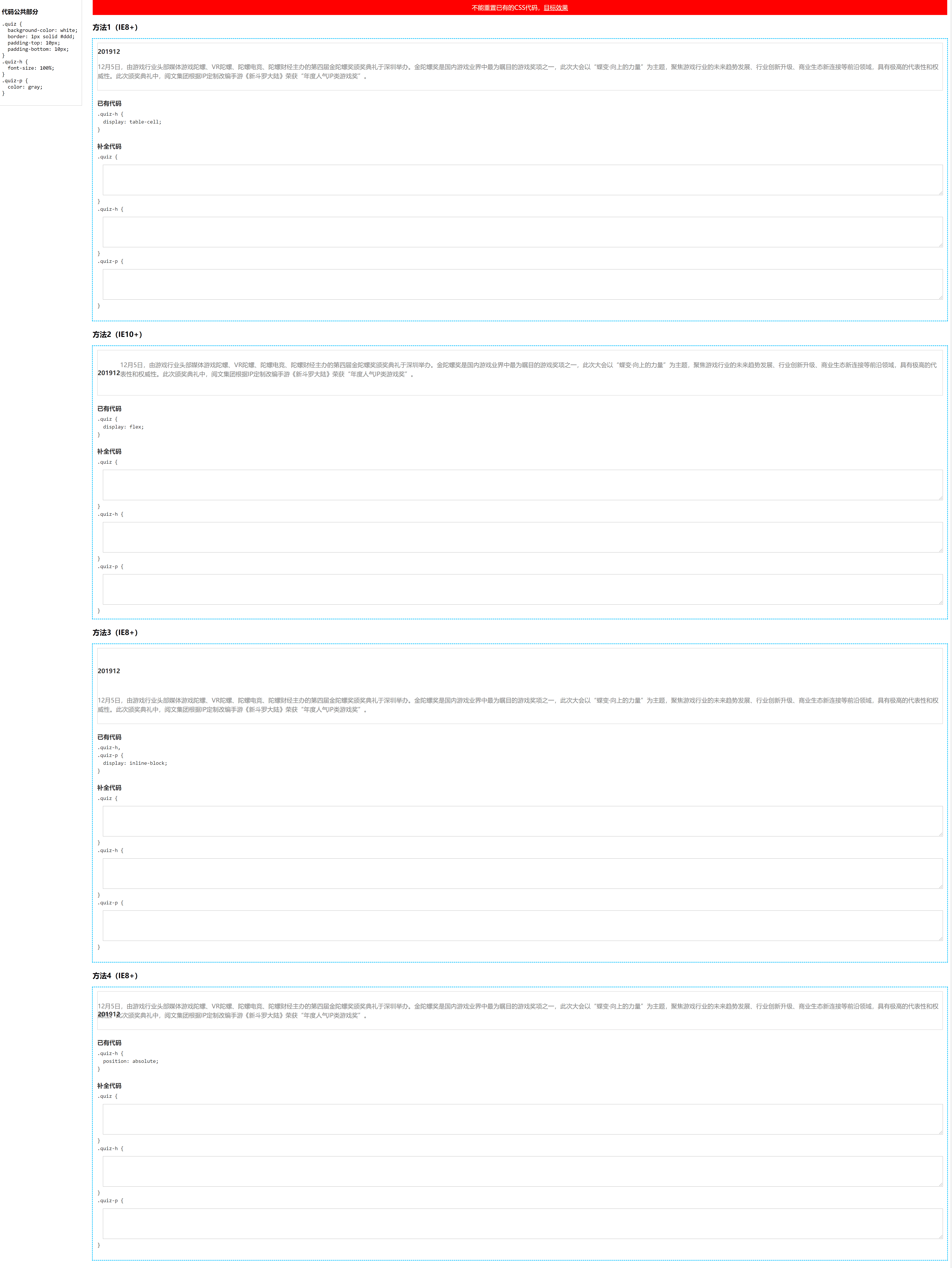
具体实现
我的实现
方法一:(实现过于啰嗦)
.quiz {
  display: table;
}

.quiz-h {
  vertical-align: middle;
  text-align: center;
  padding: 0 26px;
}

.quiz-p {
}
方法二:(flex: 1 是多余的)
.quiz {
  align-items: center;
}

.quiz-h {
  padding: 0 26px;
}

.quiz-p {
  flex: 1;
}
方法三:(这里的定宽用的不是很好)
.quiz {
  word-spacing: -1em;
}

.quiz-h {
  vertical-align: middle;
  text-align: center;
  width: 120px;
}

.quiz-p {
  vertical-align: middle;
  width: calc(100% - 120px);
}
方法四:
.quiz {
  position: relative;
}

.quiz-h {
  text-align: center;
  display: inline-block;
  width: 120px;
  top: 50%;
  transform: translateY(-50%);
  margin: 0;
}

.quiz-p {
  width: calc(100% - 120px);
  margin-left: 120px;
}
最佳实现
/* 方法1(IE8+) */
.quiz-h {
  vertical-align: middle;
}

.quiz-p {
  display: table-cell;
}

/* 方法2(IE10+) */
.quiz {
  align-items: center;
}

/* 或以下代码 */
/*
.quiz-h {
  margin: auto 0;
}
*/
/* 方法3(IE8+) */
.quiz {
  white-space: nowrap;
}

.quiz-h {
  margin: 0;
  padding: 0 10px;
  vertical-align: middle;
}

.quiz-p {
  margin: 0;
  margin-right: 90px; /* .quiz-h 的宽度(79.2px)+ 间距(10px) */
  vertical-align: middle;
  white-space: normal;
}

/* 方法4(IE8+) */
.quiz {
  position: relative;
}

.quiz-h {
  top: 0;
  bottom: 0;
  /* 垂直方向上的流体布局,注意让文字垂直居中 */
  height: 1.5em;
  margin: auto 10px;
}

.quiz-p {
  margin: 0 5px 0 80px;
}
实现要点
- 第一题只有 1 个人回答完全 OK。display: table 需要设置宽度 100%,以及第一个单元格的尺寸,这个实现啰嗦。这一题的答案比大家想的要简单,.quiz-p {display: table-cell;} 就结束了。(匿名表格特性)
- flex 实现。align-items: center 方法之一,还可以直接控制子项的 margin,.quiz-h { margin: auto 0; }
- inlinle-block 实现,大家基本上都是 white-space: nowrap 实现的,有位小伙伴稍微有点区别,就是.quiz-h 宽度 0. 还可以使用 margin 负值实现(参考录播视频)。
- absolute 定位实现,top: 50% - 1/2 自身高度(IE6+支持),还有定高+top:0; bottom: 0; margin:auto(IE8+)。
- calc()计算还是 transform 定位,这些 IE8 都不支持,IE9+支持。