了解 CSS :focus-within 伪类
CSS :focus-within 伪类选择器和 IE8 就开始支持的:focus 可以说是近亲,区别在于:focus 表示当前元素处于 focus 状态时候干嘛干嘛,而:focus-within 表示当前元素或者当前元素的子元素处于 focus 状态时候干嘛干嘛。
举个例子:
form:focus {
  outline: solid;
}表示仅仅当<form>处于 focus 状态时候,<form>元素 outline 出现。换句话说,子元素 focus,可以让任意父级元素样式发生变化。
这个新特性的支持,未来势必会带来更加丰富的交互形式,以及特定场景简化我们实现。
CSS :focus-within 伪类实际应用举例
表单输入勿扰模式
当我们表单输入,选择或者进行交互时候,页面上表单以为其他内容全部都不可见。
<!DOCTYPE html>
<html lang="en">
<head>
<meta charset="UTF-8">
<meta name="viewport" content="width=device-width, initial-scale=1.0">
<meta http-equiv="X-UA-Compatible" content="ie=edge">
<title>Document</title>
<style>
html,
body {
background-color: white;
margin: 0;
}
form {
transition: outline .2s;
outline: 2000px solid hsla(0,0%,100%,0);
position: relative;
z-index: 1;
}
form:focus-within {
outline: 2000px solid hsla(0,0%,100%,1);
}
</style>
</head>
<body>
购物订单详情
<form class="p20 bgwh">
<h6 class="f14 b">完成您的购物订单 <i class="icon icon_title_inf vn ui-tips" title="星号为必填"></i></h6>
<div class="clearfix mt15">
<label class="left">邮箱<span class="red abs">*</span></label>
<div class="cell">
<input type="email" class="ui-input" name="email" required="">
</div>
</div>
<div class="clearfix mt15">
<label class="left">手机号<span class="red abs">*</span></label>
<div class="cell">
<input type="tel" class="ui-input" name="tel" required="">
</div>
</div>
<div class="clearfix mt15">
<span class="left">您的款式<span class="red abs">*</span></span>
<div class="cell">
<input type="radio" id="radioMale" name="type" value="488"><label class="ui-radio" for="radioMale"></label><label class="mr20 ml5" for="radioMale">男款</label>
<input type="radio" id="radioFemale" name="type" value="388" required=""><label class="ui-radio" for="radioFemale"></label><label for="radioFemale" class="ml5">女款</label>
<p id="radioMaleP" class="dn mt10">男款每件488元</p>
<p id="radioFemaleP" class="dn mt10">女款每件388元</p>
</div>
</div>
<div class="clearfix mt15">
<label class="left" for="number">购买数量<span class="red abs">*</span></label>
<div class="cell">
<input type="number" id="number" class="ui-input" min="1" max="10" size="5" value="1" required="" placeholder="直接输入数值">
</div>
</div>
<div class="clearfix mt15">
<label class="left">所在城市<span class="red abs">*</span></label>
<div class="cell">
<select id="citySelect" required="">
<option value="">请选择</option>
<option value="10">深圳</option>
<option value="5">上海</option>
<option value="7">北京</option>
<option value="8">成都</option>
<option value="6">武汉</option>
</select>
<p class="mt10 dn">运费: <strong id="transPrice" class="red">0</strong> 元</p>
</div>
</div>
<div class="clearfix mt15">
<label class="left">给商家留言</label>
<div class="cell">
<div class="ui-textarea"><textarea name="message" rows="4" maxlength="200" placeholder="少于200字符"></textarea></div>
</div>
</div>
<div class="clearfix mt15">
<span class="left"> </span>
<div class="cell">
<input type="checkbox" id="checkInsur" name="insurance" value="0.4"><label class="ui-checkbox" for="checkInsur"></label><label class="ml5" for="checkInsur">使用运费险0.4元</label>
</div>
</div>
<p class="pay">您总共需要支付 <strong id="total" class="red">0</strong> 元</p>
<div class="clearfix mt15">
<span class="left">是否货到付款</span>
<div class="cell">
<input type="checkbox" id="switch" name="pay"><label class="ui-switch" for="switch"></label>
</div>
</div>
<div class="clearfix mt15">
<label class="left" for="achieveDate">希望到货日期</label>
<div class="cell">
<span class="ui-input ui-date-input"><input type="date" id="achieveDate" name="achieve" value="2015-12-27" min="2015-12-27"></span>
<span class="gray ml20">默认尽快发货</span>
</div>
</div>
<div class="clearfix mt20">
<span class="left"> </span>
<div class="cell">
<input type="submit" id="validateSubmit" class="ui-button ui-button-primary" value="提交">
</div>
</div>
</form>
</body>
</html>本案例是真实的勿扰模式效果可以放心大胆在实际项目中使用,因为这是一个体验增强的交互,就算浏览器不支持,对原本功能也不会有任何影响。
带计数文本域的 focus 高亮
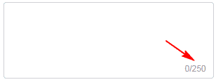
对于带计数的组件化的多行文本域,计数的数值通常是设计在文本域的右下角,这样能够适应各种复杂的场景。如下截图:
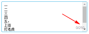
然而这种设计对我们的布局实现带来的挑战。
我们通常想到的方法是,计数元素浮在下面的 textarea 元素上。然而这种实现存在有致命的不足,那就是输入框的内容有可能和我们的计数重叠,以及出现的滚动条和技术文本重叠,如下截图所示:
因此,我们通常做法就是:边框使用父级<div>元素模拟,文本域元素和技术元素上下依次排列(非重叠),文本域原本的边框去除。
假设 HTML 如下:
<div class="textarea-x">
  <textarea></textarea>
  <label class="textarea-count">0/250</label>
</div>
则核心 CSS 这样:
/* 父级div元素模拟边框 */
.textarea-x {
  border: 1px solid #d0d0d5;
  border-radius: 4px;
  background-color: #fff;
}

/* 文本域原本的边框去除 */
.textarea-x > textarea {
  border: 0;
  background: none;
}然而上面的实现有个非常严重的不足,那就是<textarea>元素 :focus 时候,边框无法高亮,因为 CSS 中没有父选择器!
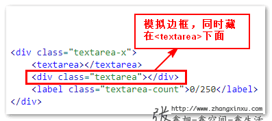
因此,实际开发的时候,我们会使用相邻兄弟选择器,以及新建一个兄弟元素来模拟边框。
HTML 结构如下:
<div class="textarea-x">
  <textarea></textarea>
  <div class="textarea"></div>
  <label class="textarea-count">0/250</label>
</div>
原理如下图示意:
.textarea-x {
  position: relative;
  z-index: 0;
}

.textarea-x > textarea {
  border: 0;
  background: none;
  outline: 0;
  resize: none;
  position: relative;
}

.textarea-x > .textarea {
  position: absolute;
  border: 1px solid #d0d0d5;
  border-radius: 4px;
  background-color: #fff;
  top: 0;
  bottom: 0;
  left: 0;
  right: 0;
  z-index: -1;
}

.textarea-x > :focus + .textarea {
  border-color: #00a5e0;
}
由于.textarea 元素和原生的<textarea>元素是相邻兄弟关系,因此我们可以借助相邻兄弟选择器,让<textarea>元素 focus 时候后面用来模拟边框的 .textarea 元素高亮。也就是这么一段 CSS 代码:
.textarea-x > :focus + .textarea {
  border-color: #00a5e0;
}
这种实现兼容 IE7+ 浏览器。
<!DOCTYPE html>
<html lang="en">
<head>
  <meta charset="UTF-8">
  <meta name="viewport" content="width=device-width, initial-scale=1.0">
  <meta http-equiv="X-UA-Compatible" content="ie=edge">
  <title>Document</title>
  <style>
    html,
    body {
      background-color: white;
      margin: 0;
    }

    .textarea-x {
      max-width: 300px;
      padding: 1px 1px 24px 0;
      border-radius: 4px;
      -ms-box-sizing: border-box;
      box-sizing: border-box;
      overflow: hidden;
      position: relative;
      z-index: 0;
    }

    .textarea-count {
      position: absolute;
      font-size: 12px;
      line-height: 16px;
      bottom: 5px; right: 10px;
      color: #999;
    }

    .textarea-x > textarea {
      display: block;
      width: 100%;
      padding: 7px 9px;
      border: 0;
      background: none;
      -ms-box-sizing: border-box;
      box-sizing: border-box;
      outline: 0;
      resize: none;
      position: relative;
    }

    .textarea-x > .textarea {
      position: absolute;
      border: 1px solid #d0d0d5;
      border-radius: 4px;
      background-color: #fff;
      top: 0;
      bottom: 0;
      left: 0;
      right: 0;
      transition: border-color .2s;
      z-index: -1;
    }

    .textarea-x > :focus + .textarea {
      border-color: #00a5e0;
    }
  </style>
</head>
<body>
  <div class="textarea-x">
    <textarea id="forFocus" maxlength="250" rows="5"></textarea>
    <div class="textarea"></div>
    <label for="forFocus" class="textarea-count">0/250</label>
  </div>
</body>
</html>
但是,现在有了 CSS :focus-within 伪类选择器,我们的事情就简单多了。
<!DOCTYPE html>
<html lang="en">
<head>
  <meta charset="UTF-8">
  <meta name="viewport" content="width=device-width, initial-scale=1.0">
  <meta http-equiv="X-UA-Compatible" content="ie=edge">
  <title>Document</title>
  <style>
    html,
    body {
      background-color: white;
      margin: 0;
    }

    .textarea-x {
      max-width: 298px;
      border: 1px solid #d0d0d5;
      border-radius: 4px;
      background-color: #fff;
      padding-bottom: 24px;
      transition: border-color .2s;
      overflow: hidden;
      position: relative;
    }

    .textarea-count {
      position: absolute;
      font-size: 12px;
      line-height: 16px;
      bottom: 5px; right: 10px;
      color: #999;
    }

    .textarea-x > textarea {
      display: block;
      width: 100%;
      padding: 7px 9px;
      border: 0;
      background: none;
      -ms-box-sizing: border-box;
      box-sizing: border-box;
      outline: 0;
      resize: none;
    }

    .textarea-x:focus-within {
      border-color: #00a5e0;
    }
  </style>
</head>
<body>
  <div class="textarea-x">
    <textarea id="forFocus" maxlength="250" rows="5"></textarea>
    <label for="forFocus" class="textarea-count">0/250</label>
  </div>
</body>
</html>
更多场景
:focus-within 伪类原本设计的作用是原生表单元素 focus 时候,祖先<form>元素可以也有状态变化。
但是在我看来,:focus-within 功能之强悍,远远不是仅仅和祖先<form>元素玩过家家这么简单。
理论上,只要页面上任意一个元素 focus,通过:focus-within 就能对页面上任意的元素进行样式控制。
例如:
html:focus-within xxx {
}-
相邻选择器,加号,或者弯弯都只能选择后面的元素,但是有了:focus-within,我们就可以对前面元素进行控制,虽然只能在:focus 行为场景下。例如请重复输入密码时候,让上面的输入密码框也高亮。
-
基于纯 CSS 和 focus 行为实现下拉列表的交互成为了可能。只要把按钮和下拉元素放在一个容器中,就可以了。
<!DOCTYPE html>
<html lang="en">
<head>
  <meta charset="UTF-8">
  <meta name="viewport" content="width=device-width, initial-scale=1.0">
  <meta http-equiv="X-UA-Compatible" content="ie=edge">
  <title>Document</title>
  <style>
    html,
    body {
      background-color: white;
      margin: 0;
    }

    .bar {
      background-color: #e3e4e5;
      color: #888;
      padding-left: 40px;
    }

    .summary {
      display: inline-block;
      padding: 5px 28px;
      text-indent: -15px;
      -webkit-user-select: none;
      -moz-user-select: none;
      -ms-user-select: none;
      user-select: none;
      outline: 0;
      position: relative;
      z-index: 1;
    }

    .summary::after {
      content: '';
      position: absolute;
      width: 12px; height: 12px;
      margin: 4px 0 0 .5ch;
      background: url(./arrow-on.svg) no-repeat;
      background-size: 100% 100%;
      transition: transform .2s;
    }

    .details:focus-within .summary,
    .summary:hover {
      background-color: #fff;
      box-shadow: inset 1px 0 #ddd, inset -1px 0 #ddd;
    }

    .details:focus-within .summary::after {
      transform: rotate(180deg);
    }

    .box {
      display: none;
      position: absolute;
      border: 1px solid #ddd;
      background-color: #fff;
      min-width: 100px;
      padding: 5px 0;
      margin-top: -1px;
    }

    .details:focus-within .box {
      display: block;
    }

    .box a {
      display: block;
      padding: 5px 10px;
      transition: background-color .2s, color .2s;
      color: inherit;
    }

    .box a:hover {
      background-color: #f5f5f5;
    }

    .box a:active {
      background-color: #f0f0f0;
      color: #555;
    }

    .box sup {
      position: absolute;
      color: #cd0000;
      font-size: 12px;
      margin-top: -.25em;
    }

    a {
      color: inherit;
      text-decoration: none;
    }
  </style>
</head>
<body>
  <div class="bar">
    <div class="details">
      <a href="javascript:" class="summary" tabindex="0">我的消息</a>
      <div class="box">
        <a href="javascript:">我的回答<sup>12</sup></a>
        <a href="javascript:">我的私信</a>
        <a href="javascript:">未评价订单<sup>2</sup></a>
        <a href="javascript:">我的关注</a>
      </div>
    </div>
  </div>
  <p>这里放一段文字表明上面的是悬浮效果。</p>
</body>
</html>